r/calligraffiti • u/monsterriffs • 15d ago
blue/black medallion - tips on consistency and flow welcomed!
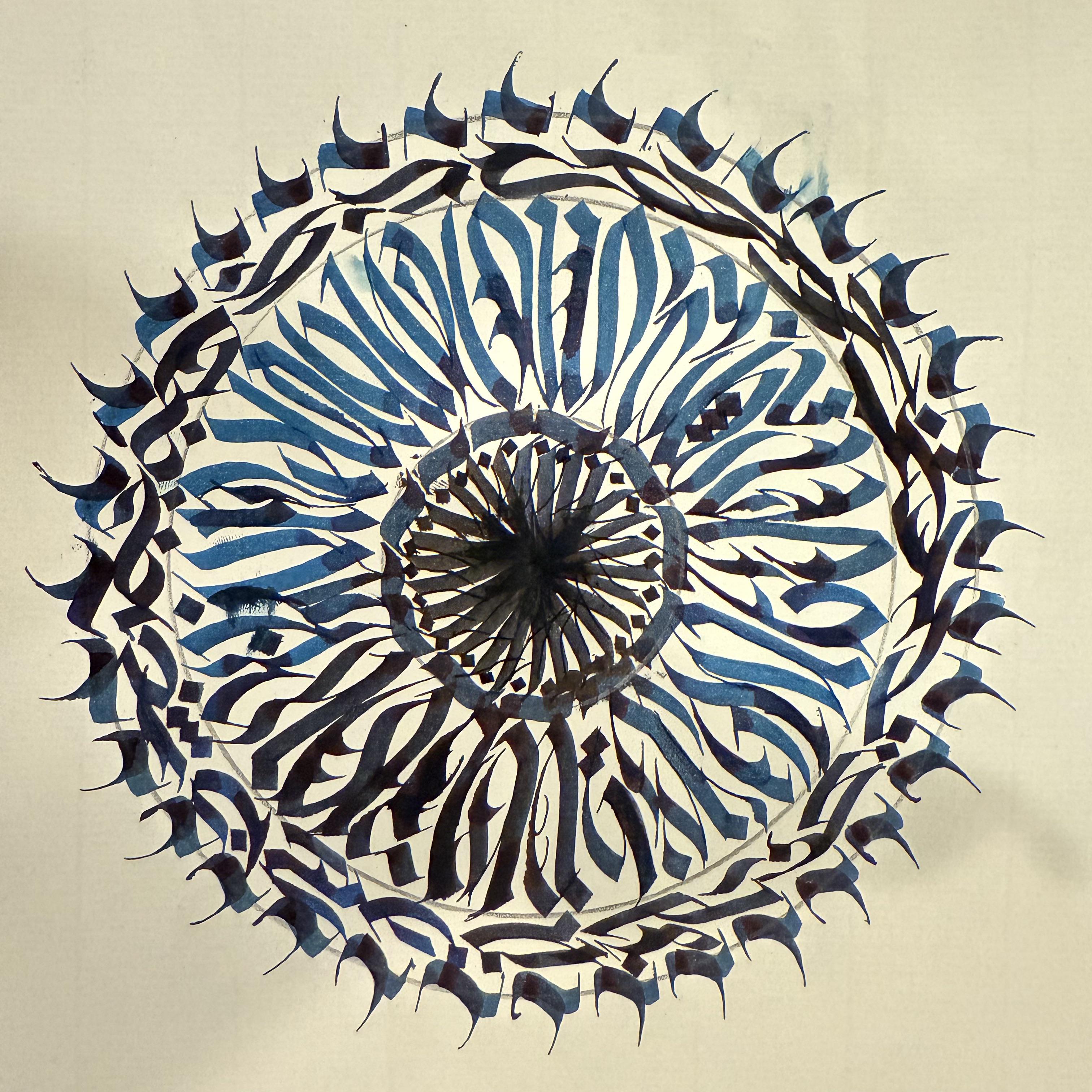
I’ve been teaching myself calligraphy and calligraffiti for a little more than a year now. I’ve been messing with some medallion designs for the past week after seeing some of the posts on here.
I’m pretty happy with this one except for maybe the center and the outer ring with the randomized horizontal strokes. I want to create rings that juxtapose horizontal stroke flow with vertical stroke flow, but I have a much harder time doing that in the horizontal orientation. But I welcome all feedback and tips since I’m pretty early in my journey here!
Piece composed with parallel pens using black ink cartridges and dips in iroshizuku blue ink.
2
u/Embarrassed_cow_512 14d ago
as a traditional graf artist i will always be shocked by calligraffiti
1
1
2
u/EMAGDNlM mod 14d ago
leave space in the center so you dont have to do weird stuff that shrinks into nothing. or do a circle full of vertically oriented letters/texture, then if you do a ring of text, the baseline will be more manageable and less squished together. also leave some breathing room between the rings imo.
try this. set up a 3-4" diameter circle, fill it with vertically oriented letters/texture. then leave a 1/2" - 3/4" space, then do a 1.25"-1.75" ring around that depending on stroke width (but that should be good for a small 6mm or a slightly stretched 3.8mm) with the center orientation going around the ring. either condense it or let the ascenders/descenders break the boundary within your open space. then proceed to add more from there if you want. hopefully you get a nice balanced composition with legible letters or a nice texture with some good variation.