r/dataisbeautiful • u/Fun-Pace-4636 • 5d ago
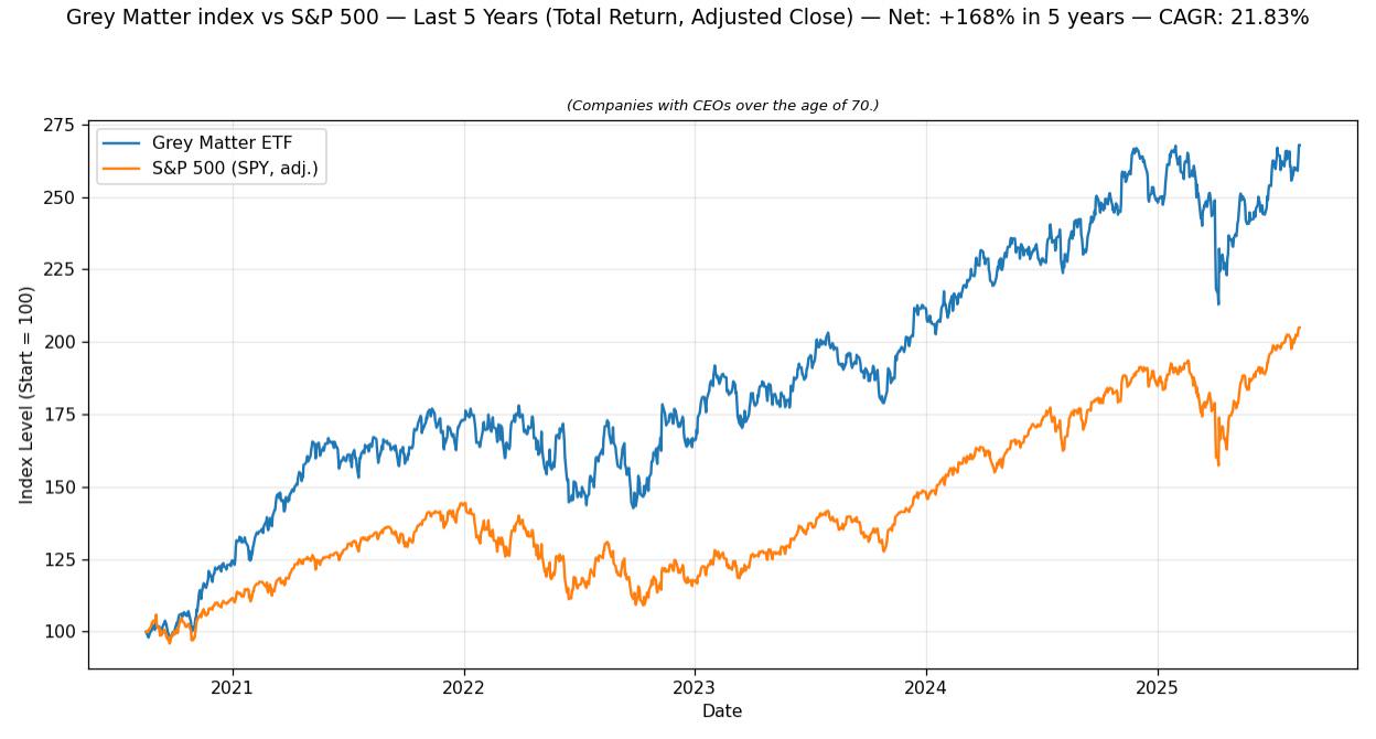
OC [OC] Companies with CEOs over the age of 70 outperform the S&P 500
Index made of a mash of companies over the age of 70
1.2k
u/lucianw 5d ago
Hot take: if you plot a graph like this of several time series and you arbitrarily pick t=0 as the point at which they're all equal, then you must also plot four other graphs where you pick different dates on which they're equal.
That way you get more intellectual rigor in determining whether the stories the graphs tell are true, or just a visual artifact of your arbitrary starting point.
129
u/Radical_Coyote 4d ago
Exactly. It looks like the divergence happens entirely between late 2020 and mid 2021. After that there is no meaningful difference their behavior in log space. If anything I would guess this has more to do with certain companies crashing and then recovering more during the pandemic than any law of nature
54
u/Illiander 4d ago
between late 2020 and mid 2021
Every graph with a date axis needs a giant sign on those dates saying "COVID bullshit happened here"
2
u/Armigine 4d ago
It looks like that's the period of most significant divergence, but the period of mid-2022 to end of 2024 seems like the top set grows significantly faster than the bottom; it's obscured by how the difference is lower and there is already more room between them visually
2
u/Radical_Coyote 4d ago
It’s an illusion because this is plotted in linear space. Look for example at the mid-2022 peak, 175/125=1.4. Compare that to some later date, say 2025, and you see 250/185<1.4. So if the chosen starting date was 2022, then the orange curve would appear to grow faster
182
u/halberdierbowman 5d ago
I'm always confused why graphs like this exist. Wouldn't it make way more sense to show the derivative of these graphs, to see the instantaneous percentage growth at every point in time all at once? It would immediately show the exact thing you're asking about.
64
u/JeromesNiece 5d ago edited 5d ago
For asset returns, what you care about is the total return and the variance. It can be hard to tell what the difference in total return is just by looking at a chart of annualized returns per time period. It doesn't do you much good to have a slightly higher chance of experiencing higher returns on a random day if at the end of the total period the other asset has outperformed on total returns.
Can you tell from this chart which index outperformed the other during this time period?
2
u/DevelopmentSad2303 4d ago
It would make more sense, but a better metric would be some sort of return function to smooth out noise
3
u/Qinistral 4d ago
This gets me every time. I compare a few stocks/funds then set the time to 1y or 5y and star panning left and right and it changes so much as you drag.
2
1
u/Books_and_Cleverness 4d ago
I’m fine with people just posting weird charts that don’t really prove anything definitive. It’s a starting point for a conversation, not a formal proof.
It’s a lot of work to control for all those other things and do tests for robustness and all that. Notably, none of the complainer comments are supplying their own revised graph. If you want to actually know things with any confidence then yeah you gotta do that.
1
u/jointheredditarmy 4d ago
I mean the delta clearly has a slope so you can probably pick any point and get a similar effect.
519
u/not-picky 5d ago
The effect seems most pronounced at exactly the start of the chart. Are we sure we haven’t simply selected a date range that most produces this outcome?
178
25
u/FaultySage 5d ago
The effect seems to be exclusive to that 2020-2021 time frame. After that the two track each other almost perfectly, it's just the 70+ index is a few points higher, but this only seems to matter if you bought in in 2020, an investment at any other point would perform more or less equivalently.
I feel like if we could zoom in on the 2020-2021 time points and break this down by company we could find other reasons the split may have happened there.
9
u/WanderingFlumph 5d ago
Noticing that if you start at 2022 the effect seems to almost entirely disappear
6
u/AnyPaint9989 5d ago
It looks like they normalised it to starting at 100 in order to compare their growths against eachother. Similar to how people plot graphs of wage increases against housing price if you have seen them.
It then makes more sense when they started, as its after the market collapse around March 2020.
37
u/YourPalCal_ 5d ago
But what the comment meant is that if they had started a year later there would be no difference between the two plots, and at earlier times the effect could be less. It makes any conclusion here less strong. All that happened is that for a 6-12 month period around 2021, companies with CEOs over 70 outperformed the s&p 500.
7
u/shumpitostick 5d ago
Actually starting it after a market collapse is a bad idea. It means that if a company crashes hard and then rebounded, you will only see the rebound and it makes it look as if a lot of value was gained.
71
u/hungarian_conartist 5d ago
Do the returns not not index. If you started this plot in the middle of 2021 instead of 2020 it might be the S&P500 outperforming grey matter.
45
22
u/Hattix 5d ago
Instead of using absolute age as a proxy, use the CEO's length of service directly.
11
u/Appropriate-Falcon75 5d ago
I think this might be the case here- a CEO who is in their 70s has probably been there 10+ years, whereas a CEO in their 50s is less likely for that to be the case.
This time means that the upper management of the company are probably all aligned well and working well together, and there probably aren't any major restructuring/outsourcing programs happening to massively affect morale/output.
0
16
u/thisisnahamed 5d ago
The timeline is too short to come to a conclusion (it's only 5 years). It would be great to see a chart over the last decades.
The markets have nothing been but irrational since COVID.
16
u/BetafromZeta 4d ago
PSA: This is not a good statistics/investment analysis
The graph should either be in log scale on the y-axis, or you should have returns by year. The annualized difference (12% vs. 8%) is what matters, your graph completely obscures that.
Then, trying to draw conclusions about such a random statistic with such a limited dataset with millions of confounding variables, is just silly. It could very easily be the sector or some other factor that is the true driver, and not the age of the CEO at all. It could also just be spurious correlation, you also haven't shown that it beats on a risk-adjusted basis.
2
u/Existing_Ad_8274 4d ago
Kinda wild that this is the only comment pointing out the missing log scale on the y-axis — that alone would solve most of the visualization issues. In log scale it’s pretty clear the “outperformance” happens almost entirely at the beginning, and afterwards the pattern isn’t that different from the S&P.
Without log, since the blue line sits at higher levels later on, it gives the illusion of consistent outperformance, when in reality it also looks like the proposed index has noticeably higher volatility
1
u/Material_Skin_3166 4d ago
Fully agree: if you plot this as a log from mid 2021, the curves are about equal.
11
8
7
u/trustworthysauce 4d ago
CEO over 70 at the time? Is the index adjusted each year to include all S&P 500 CEOs at the correct age? How many companies are in this group, and how many are Berkshire Hathaway?
46
u/shogi_x 5d ago
This is bad data science.
The age of 70 is arbitrary. There is no significant reason to use that age range.
The chosen time frame is arbitrary and heavily influenced by macroeconomic factors such as COVID and the war in Ukraine.
It's unclear whether this completely accounts for every company with a leader over 70. It's also unclear whether it includes leaders who turned 70, turned 80, died, or were appointed during this time frame.
The comparison is lacking. Yes, the selected group outperforms the S&P, but do they outperform other age ranges? Is this consistent over other time periods? What about other stock exchanges?
As mentioned elsewhere, this is rife with unmitigated bias: selection, survivorship, and more.
This could be a poster child for correlation is not causation. Even if the aforementioned problems were accounted for, there are far too many factors at play for this to mean anything.
10
u/hroaks 4d ago
OP calls it the Gray Matter Etf and Gray Matter index funds but neither seem to exist. And etfs and index funds are not the same
6
u/shogi_x 4d ago
Yeah I'm beginning to suspect OP owns some stocks which are performing well and happen to have older CEOs, and is just using this to brag.
4
u/BetafromZeta 4d ago
Their very amateurish conclusion and presentation made that pretty obvious immediately.
0
u/qtwhitecat 3d ago
I mostly agree but point 1 is bogus. When you setup some framework the first principles are allowed to be arbitrary. For example the decision to use the meter as a standard is arbitrary, but entirely permitted and having a standard is necessary to even begin using spatial dimensions.
There doesn’t have to be a discernible reason for your choice. There is no reason why technical analysis should have any predictive power yet time series analysis show that at least historically some strategies work. Likely because enough people use these strategies such that you get a self fulfilling prophecy. The same goes for something like age of ceo.
8
u/IaNterlI 4d ago
Butter production in Bangladesh also predicts the S&P 500...
One needs a lot more evidence than these types of graphs to make such a claim. Tyler Vigen created a site and a book about these humorous correlations.
Questions like these are usually assessed through a sensible study design and an equally sensible statistical analysis. And then they need to replicate in time. Otherwise, the world is filled with interesting coincidences.
11
u/egoVirus 5d ago
"Hello, Correlation? Hi, my name is Causation, have you got a minute?"
4
3
u/SteelyLan 5d ago
Hmm, looks like they outperformed in the first half of 2021 and then performed pretty representative of S&P500 from then.
3
u/fongletto 5d ago
This just in, CEO's who dont significantly outperform more likely to be replaced. In other news, companies who are struggling are also more likely to seek change by doing things like firing CEO's and hiring new talent.
3
u/Significant_Map_363 4d ago
It's a classic case of survivorship bias. The chart's starting point is conveniently cherry-picked to show the effect at its absolute peak. You'd need to see this tested across multiple starting dates to see if the trend actually holds.
3
2
2
u/morkalla 5d ago
Where can we find the information about "Grey Matter ETF"? I would like to check which companies are included.
2
u/BadHairDayToday 5d ago
If you group companies together over a plethora of categories you will find some that beat the S&P500:Tech companies, The magnificent seven, Defense stocks. In fact even the fact that we reflexively compare with the S&P500 already shows this survivorship bias, it should really be the All-World Index.
2
u/double-you 5d ago
Not a good graph. There should be data on how the upper graph differs from the lower one since it mostly just matches it in form.
2
u/tanknav 5d ago
The performance depicted here appears nearly identical except for 2020Q4-2021Q2. As noted by others, this t=0 selection will misrepresent post-COVID crash recovery so it might simply be saying Grey Matter ETF captured the crash/recovery for a few companies well. Also...a five year look at comparison vs an index is not a very large window. This is not particularly insightful and the title is deceiving.
2
u/ogzogz 4d ago
Instead of comparing against an arbitrary T=0... what if we set the latest figure as T=0 and compare historic values against it instead?
So compare August 2025 / August 2025
Then August 2025 / July 2025
Then August 2025 / June 2025
That way there is no 'arbitary' picking of historical figures. In fact its providing you all the arbitary T=0s all at once.
Here is what it looks like
(I just did S&P vs Berkshire B.. couldn't be bothered getting the rest)
Note the result chart is a little unintuitive, I also reversed the dates to make it make a bit more sense.
So the very first data point (on the left) is 19 Aug 2025 / 19 Aug 2025 (100%)
and the last data point (on the right) is 19 Aug 2025 / 20 Aug 2020 (235% vs 189%)
(I'm not OP and not really trying to make a point with the data. Just curious on ways to visualise a comparision between two stocks/portfolios to be more 'fair')
2
u/yesacabbagez 4d ago
My question is when did those people become ceos?
My immediate assumption is a lot of those ceos have held their jobs for a considerable amount of time and have remained in their position despite their age because of the performance. Those who failed to perform were canned.
I would say we are looking at a significant survivor bias. We aren't looking at the rate of successful 70+ year old ceos, but the fact that successful CEOs will often stick around into their 70s.
6
2
u/AnyPaint9989 5d ago
To add to the other comments talking about causality, companies with an older CEO are (probably) more likely to be the founders themselves, making these companies generally older and more "established" in recovering against market downturns.
The graph starts after the 2020 Covid market crash, so established companies with more experience and stability were always expected to recover better than current S&P 500s.
2
1
1
1
1
1
u/GreyGreenBrownOakova 5d ago
Now do the same for all companies with a 'G' "M' and 'E" in their ticker name vs the S&P500.
1
u/Brainchild110 5d ago
It actually looks more like the wrinklies all pulled a similar trick in 2021 to get ahead, then have been completely modiocre in their performance since.
But you do you, boo.
1
u/Intelligent-Guard267 5d ago
Being so close to death allows one to sacrifice any and everything to be successful (environment, health, family, democracy, etc)
1
u/Agloe_Dreams 5d ago
I would be interested to see the comparison of industry and company size split between the two groups.
I would bet that older CEOs likely work in traditional industries that are more stable with less knee-jerk pricing and are more rife with monopolies that can set their prices.
1
u/Hopeful-Airline-5681 5d ago
Did you switch in/out companies on their ceo birthday? Equal weight? Honestly quite interesting
1
u/EntropyRX 4d ago
1) any chart that starts during Covid is horseshit
And even if we ignore the above: 2) why only 5 years period 3) what are the sample sizes. I’m quite sure the two aren’t comparable of if they are the same size then how do you down sample CEO <70 which are obviously the majority
1
u/theeldergod1 4d ago
the older you are, the more people you know. also lords with a desire to not lose power.
1
u/Dogrel 4d ago
Could be confounding factors in that data.
Usually the companies seeking out “fresh blood” in a CEO are, or recently were, underperforming. So it logically follows that well-performing or overperforming companies would tend to have older CEOs, as there is no pressing need for major change.
1
u/silvafractus 4d ago
If you are a CEO over 70 and people want you to stay on, you must be a pretty remarkably good CEO.
1
1
u/EternalInferno22 4d ago
Ah, yes. The well-worn, "refuse to plan for succession" group. Love it. What a fun way to further illustrate the aging of the American C-suite. u/elijha said well this is likely a flip of causation. It's working out well in the political class, too! /s
1
u/EventHorizonbyGA 4d ago
You can do this yourself. But, it looks like most of the companies that have been delisted since 2021 from the S&P had CEOs under 70 as well so the "survivorship bias" effect here makes this data look even worse for younger CEOs.
Hess Corporation
John B. Hess, is 71 years old (as of 2025)
Ansys
Ajei S. Gopal, is 64 years old
Juniper Networks
Rami Rahim, is 54 years old
Discover Financial
David W. Nelms, is 64 years old
BorgWarner
Joseph F. “Joe” Fadool, is 59 years old.
Teleflex
Liam J. Kelly, is 58
Celanese
Scott A. Richardson, is 48 years old
Even Activision Blizzard's CEO (which was removed because of an acquisition) is only 62.
1
u/angry_wombat 4d ago
oh starting in 2020, I wonder what could have happened in 2020 the slowed growth in the top 500 companies?
1
1
1
1
u/Fun-Pace-4636 5d ago
For those asking this is across a longer period of time (as far back as I can get the data) - note that we're normalising the "grey matter" index and S&P 500 to 100, and the index level shows total return growth over time, meaning it accounts for both price changes and dividends.

1
-4
u/Fun-Pace-4636 5d ago
Data source is yahoo finance, tools are python and matplotlib
[Constituent Weights] (as of last monthly rebalance) Sanmina Corporation: 6.67% Aflac Incorporated: 6.67% The Walt Disney Company: 6.67% Capital One Financial Corporation: 6.67% Westlake Corporation: 6.67% Freeport-McMoRan Inc.: 6.67% Blackstone Inc.: 6.67% Enterprise Products Partners L.P.: 6.67% Air Products and Chemicals, Inc.: 6.67% Watsco, Inc.: 6.67% Skechers U.S.A., Inc.: 6.67% Penske Automotive Group, Inc.: 6.67% Berkshire Hathaway Inc.: 6.67% BlackRock, Inc.: 6.67% LVMH Moët Hennessy Louis Vuitton SE: 6.67%
0
u/autodidacthobo 4d ago
Because we are living in the 70s again. Feulner Jr lived to see the first American Pope because he was an expert on Asia. Guess what our next decade is going to mirror??
-3
u/digitalnomadic 5d ago
According to chat gpt only 3 ceos of s&p 500 companies are over 70
Berkshire Hathaway Warren Buffett 93
Blackstone Group Stephen Schwarzman 78
BlackRock Larry Fink 72
5
4.2k
u/elijha 5d ago
I would theorize that you’re flipping the causation here. Being a CEO over 70 doesn’t mean you’ll outperform. Being a CEO over 70 who doesn’t outperform means you’ll get put out to pasture by the board.