It's a cool idea but as a non-norwegian person it would have been helpful to at least have some insight on what topics are measured and what the rough political affiliation of these parties is.
This is a purely numerical analysis, and translating the 59 questions is a tad much work, and not a visualization, so I opted to keep it out here.
59 * 9 would be trying to visualize 531, most of which are not connected, and I honestly can't even think of a way to do that, given the mission of representing the actual differences between the parties.
The parties are labelled around the perimeter of the chart.
Have you never read a plot similar to this before?
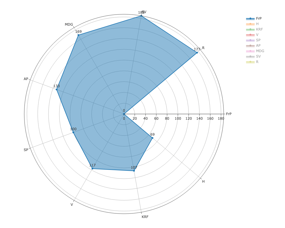
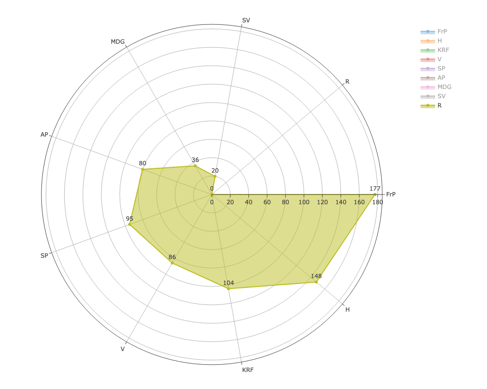
In the very first image, if you start at 3 o'clock, you'll find FrP (Progess party, most right-wing) agreeing with themselves. Move clockwise, read the perimeter, and you'll find H, Høyre, Conservatives, and so it moves around the circle, with every party labelled
The labels are contextless abbreviations? You phrase your response in a defensive manner, but from you going into to detail, you clearly realize the problem.
Explained somewhat in a different context, but to clarify: Norwegian is a very … wordy … language, so I chose to use the official short forms along the perimeter, and instead provide context in the mandatory OC comment, where I both explained the party names, including where they are on the political spectrum.
With a plurality of parties, and a more wordy language, this is different from, say, the US or UK, where there are "Democrats", "Republicans" or "Labour" and "Tory", and it can't really be simplified without hampering readability of each chart.
Add a key if you can't put the names directly on the axes. Having the data simply graphed and requiring an explanatory reddit comment isn't beautiful data. If this was posted in a norwegian sub it'd make more sense but as it is the graph simply doesn't stand on its own
Edit: do the parties have logos? Why not use those?
Again, good data, but it's really hard to tell what is happening here. You have to slowly take the data in for even the more obvious conclusions, such as R, MDG and SV sharing many values.
Also, no reason to keep abbreviating. It just makes the data harder to read.
Who the hell are MDG, SV and R? OOOOOH... Red, Green and Socialist, that makes sense now....
The abbreviations are an aesthetic choice because Norway is a wordy language. The Greens/MDG are called actually named "Miljøpartiet De Grønne", or literally in English "The green environmental party" (corrected for grammar/word order)
I think it is a cultural thing. In Belgium too most parties are known exclusively by their abbreviations to most. Putting the full names on it might confuse a lot of people!
The audience wouldn't know the parties anyway. The closest thing you could do is put up their overarching European party names, but most people don't know those either, and those who do know them by their abbreviations...
There are issues with data representation, and perhaps a legend could help with the abbreviations, but quite honestly there is no way for an international audience to interpret this data anyway, and for all we know for a domestic audience the abbreviations are more convenient.
They wouldn't know the full name either, unless the party for some reason has been in the news, and the full name might actually even be confusing.
For instance, the Norwegian "Venstre". Literally, that word translates to "Left". On the political spectrum, they lean right in economic policies, and are in some respects a "small state"-party. They're politically anchored to the right side in Norway.
Then there is "Fremskrittspartiet", which translates as "The progress party". On an american axis, they'd never be considered as progressive. They are a party that borders on right-wing extreme liberalism, and have shifted heavily towards downright MAGA policies, whereas "progressive" would normally imply left-leaning in the US.
"Arbeiderpartiet", lit. "Worker's party", but are associated with Labour in the UK. A US person would quite likely associate them with communism. They're centre left, social democratic. There's nothing communist about them, and have transitioned from being viewed as a leftist party, towards being a centrist party, but still anchored in the unions and workers rights.
"Kristelig Folkeparti", lit. "People's Christian Party". Their own f*cking leader said that it's not likely that Jesus would've voted for them. After a leadership shuffle a few years ago, they're an anti-LGBTQ-party attempting to promote and enforce Christian values, and alongside Fremskrittspartiet, they're competing to be the most MAGA party there is.
Tools: Spreadsheet, Javascript/Node.js, Homegrown web app using Plotly
Background: This is the outcome of collecting data from a vote matching tool created by the Norwegian Broadcasting Corporation. In this tool, 59 separate claims were made, and each parties' response were put into one of four categories: "Strongly disagree", "Somewhat disagree", "Somewhat agree" and "Strongly agree". In the diagrams in this post, the responses were substituted with scores of 1,2, 4 and 5 respectively - as such adding an extra divide between agree/disagree.
The parties whose responses were collected, on a subjective rank from "most right-wing" to "most left-wing":
FRP, Fremskrittspartiet, en. Progress Party
H, Høyre, en. Conservatives
KrF, Kristelig Folkeparti, en. Christian Democrats
V, Venstre, en. Liberals
SP, Senterpartiet, en. Centre/Centre Party
AP, Arbeiderpartiet, en. Labour
MDG, Miljøpartiet De Grønne, en. Green Party
SV, Sosialistisk Venstreparti, en. Socialist Left
R, Rødt., en. Red
The dividing line between the right and left is typically between V and SP.
Method: For each question/claim in the tool, the absolute difference between each party was collected, so for instance R answering "Strongly agree" and FrP answering "Strongly disagree" would result in a difference score of 4 for that question. The difference score is the sum of differences for all questions.
Tools used: Spreadsheet for collecting the numbers, exported to CSV. This was then further processed and grouped by a Javascript, to then be output using Plot.ly in a web browser, and exported to PNG.


51
u/Slu1n 2d ago
It's a cool idea but as a non-norwegian person it would have been helpful to at least have some insight on what topics are measured and what the rough political affiliation of these parties is.