r/dataisbeautiful • u/Arve OC: 2 • 4d ago
OC [OC] Level of disagreement between political parties in Norway
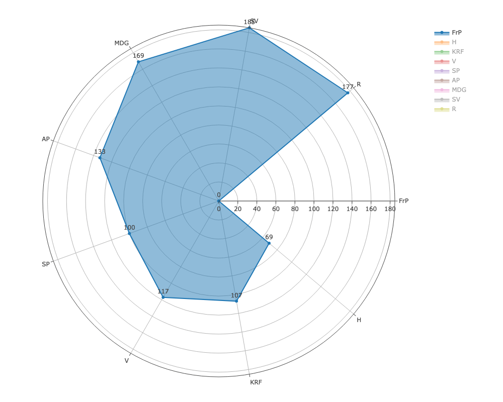
Disagreement between FrP and: SV: 185, R: 177, MDG: 169, AP: 133, V: 117, KRF: 107, SP: 100, H: 69

Disagreement between H and: R: 148, SV: 146, MDG: 130, SP: 93, AP: 90, KRF: 86, V: 80, FrP: 69

Disagreement between KrF and: FrP: 107, SV: 106, R: 104, MDG: 92, H: 86, V: 78, AP: 78, SP: 77

Disagreement between V and FrP: 117, SP: 109, AP: 90, R: 86, SV: 84, H: 80, KRF: 78, MDG: 68

Disagreement between SP and: V: 109, SV: 101, FrP: 100, MDG: 95, R: 95, H: 93, KRF: 77, AP: 63

Disagreement between AP and: FrP: 133, H: 90, V: 90, R: 80, KRF: 78, SV: 74, MDG: 68, SP: 63

Disagreement between MDG and: FrP: 169, H: 130, SP: 95, KRF: 92, V: 68, AP: 68, R: 36, SV: 28

Disagreement between SV and: FrP: 185, H: 146, KRF: 106, SP: 101, V: 84, AP: 74, MDG: 28, R: 20
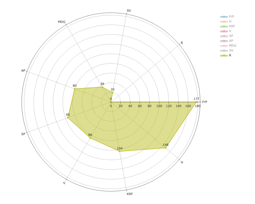
Disagreement between R and: FrP: 177, H: 148, KRF: 104, SP: 95, V: 86, AP: 80, MDG: 36, SV: 20
49
u/Slu1n 4d ago
It's a cool idea but as a non-norwegian person it would have been helpful to at least have some insight on what topics are measured and what the rough political affiliation of these parties is.