r/dataisbeautiful • u/FluidModeNetwork • 19h ago
OC [OC] Overall ranking for 51+ Countries
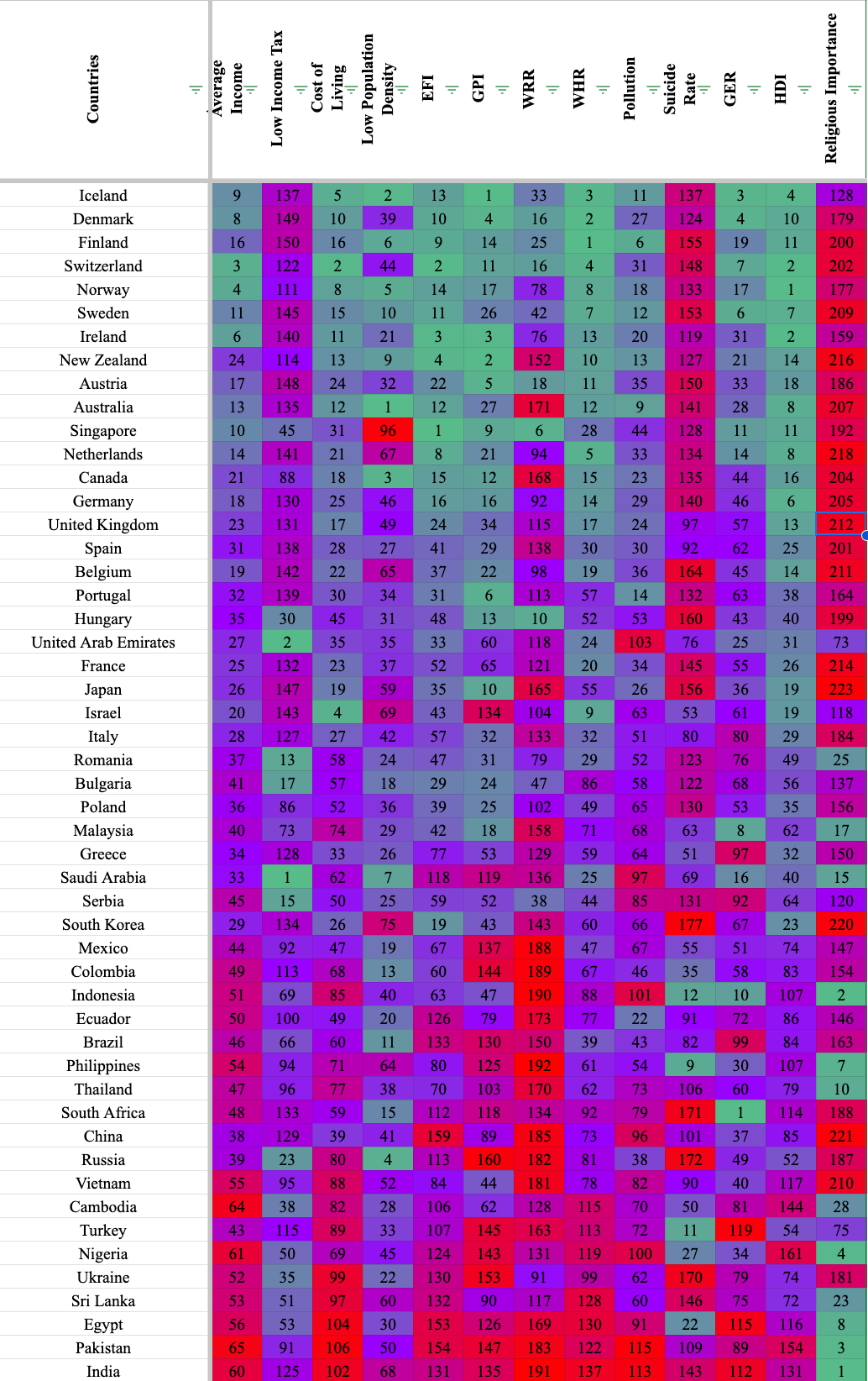
My sheets document includes the sources, but the ranking uses 13 different sources. Sadly, not every country is included in every source so you will see blank spaces for countries that are left out in the data. I've also created a correlation index to see how different metrics matched up with each other and you can see the data I used for each ranking.
https://docs.google.com/spreadsheets/d/1YbfVevxEthNgDtK69P48Xm39bXLHi8eqfeFwxTTYEJE/edit?usp=sharing
Hope you like it, lemme know if you have any questions.
3
u/FriedRice2682 19h ago
Would have been great to have a legend for acronyms.
Also does every components have the equivalent weight when it comes to the order they are in ? If so, why not add a total ?
1
u/FluidModeNetwork 18h ago
Some of the sources have lengthy names, so thats why I also included the spreadsheet for those interested in what sources I used.
Can you clarify that last part? I took the countries, ranked them according to the data, then divided by the max value in the column, then added them up and ranked the countries by lowest.
1
u/FriedRice2682 16h ago
So it's probably missing out the subtotal per column and total for the lines which would have been for me a great way to quicly synthesize the data in a data analysis.
Therefore, my only critisim would be that not all components should have the same weight when comparing countries especially if you have different sources. I.e average income has the same weight as religious importance which offset the score and quality of the data when it comes to providing an overall picture. Also, it would have been great that you state what was reason behind choosing those elements. Is it to provide a view of how those countries provide liberal comfort and opportunities ?
But, nice spreadsheet. I know people like graphs, but I love numbers, because they make it easy to answer subsequent questions when looking at the larger image.
1
u/FluidModeNetwork 16h ago
So in the sheet, they are there, I just assumed people would know a country is number one because it was at the top. Now heres the problems I have with your comment.
I have that data for both how many sources a country has filled in and what its rank is. It didn't make sense to show all of it because the country rankings are based on the entire data set, without concern for how many spots it filled.
They are all weighted by individual source. I made the ranking of the specific metric according to the data, and had each country be divided by the max value, then added together to determine overall rank. They don't have the same weight, their weighted per their metric then summed up
I understood things like weather, income, suicide rates, and population density to be things anyone would consider valuable in determine what country they would like to live or visit. The Human Development Index, World Happiness Index, and Global Emotions Report are also popular and show the value a country has for newcomers.
10
u/dreamyangel 19h ago
Religious importance should not be colorized really
10
u/InevitablePresent917 19h ago
You don't think a strong inverse correlation between religiosity and things like HDI is worth noting?
1
u/CryzMak 19h ago
If there is a such a correlation, then why not simply include HDI, if this is the relevant thing in the end ?
1
u/InevitablePresent917 18h ago
I'm not sure how to answer that question, because it begs the question. The correlation, if it exists (which it seems to based on the chart), would be the relevant thing: there appears to be a correlation between things like human development and happiness and a (much) lower focus on religiosity. Also, unless you're a bad faith actor you don't tailor a chart to reach a conclusion; you draw conclusions from the data.
1
u/CryzMak 18h ago
I think that in the end, it depends on the goal of such visualisation. I am not sure of OP's goal, but I guess that they wanted to do a "best-country overall ranking" aggregating several indicators of what they think makes a "good" country. So I don't think their goal was to find a correlation between the features. Then, I think it is fair to argue that for equal HDI, religiousity is neither "good" or "bad". So if you already include HDI in your ranking, why attach a value to a low or high religiosity
1
u/InevitablePresent917 18h ago
The goal of the visualisation appears to be to present multiple ranking metrics in one place to show an overall relationship between various rankings.
I can't really make sense of your comment otherwise. I'm not sure why including HDI would preclude also including a religiosity ranking, if both are measures of social factors in a country. Is your concern that you don't want religiosity to be viewed as "bad"? Because nobody, including the data, is asserting that, only that high religiosity does not seem to exist in the happiest, most developed countries.
2
u/CryzMak 18h ago
The goal of the visualisation appears to be to present multiple ranking metrics in one place to show an overall relationship between various rankings.
Well I do not agree with you. That is not how I understand "overall ranking".
1
u/InevitablePresent917 18h ago
Which is a red herring. Whether "overall" means "view of many data points together" or "meta-ranking based on aggregate rankings" or something else, I'm not sure why excluding religiosity makes any more sense than excluding HDI or any other rating.
1
u/CryzMak 18h ago
As I said, if you're doing a meta-ranking based on aggregate rankings, people might not agree on whether some features, like religiosity, hold a positive or negative value in their meta-ranking. In OP's post, it seems that religiousity is a positive feature, with highly religious countries being in green and country with low religiousity being in red. The first comment of this thread was arguing that religiousity should not have an impact on a country's "meta-ranking" because it is not a "good" or "bad" thing, especially if you already take HDI (which is correlated with religiousity, as you rightfully underlined) into account.
1
u/InevitablePresent917 17h ago
"Religiosity Importance" suggests that a high rank (green) means religion is important (and that certainly checks out anecdotally given the countries with a red religiosity score--religion is not a large part of life in those places). I don't think OP's green and red scores mean "good/bad" but "high/low". Countries where religion is important rank high on that score and are therefore green (closer to 1). Whether religiosity is good or bad depends on the reader. But it is interesting to see that high religiosity appears to be (as noted above) inversely correlated to high measures of happiness and development.
→ More replies (0)6
u/chrissz 19h ago
Yes it should. No one cares about your make believe man in the sky who tells you to force your beliefs on others.
6
1
u/HarrMada 17h ago
The only three state atheist countries in the world are China, Vietnam, and North Korea. Clearly the hallmark of the world's perfect societies.
1
u/chrissz 17h ago
It all makes sense now. And here I was thinking their problems were caused by things like totalitarianism, brutal dictatorships, and single-party communism. Turns out it was just the lack of a god all along! Who knew? You somehow conveniently left out highly secular, prosperous, and free democracies like Sweden, Denmark, Japan, or the Netherlands. Nope, those don't exist. Only the three you mentioned. And since all of the countries you mentioned all eat rice as the primary staple food, that must be the grain of tyranny, by your false association logic. And here I thought it was the totalitarianism, brutal dictatorships, and single-party communism. Turns out it was just the lack of a god all along! Who knew? You’ve cracked it.
1
u/HarrMada 16h ago edited 16h ago
Is this really the best argument you can make? Christ. The most "prosperous" countries are neither state religious or state atheist, that's sort of my point. The best countries are actually when you are allowed to believe whatever you want, religious freedom.
1
u/FluidModeNetwork 15h ago
You could be onto something. US News has a religious freedom ranking.
https://www.usnews.com/news/best-countries/rankings/religious-freedom
A lot of the countries that are up top according to my sheet show up on this list. Just remember as well that although a country has more religious freedom, that doesn't mean they have more community.
1
1
u/FluidModeNetwork 19h ago
I included it because I was interested if there was a correlation between religious importance and suicide rate, turns out there was none.
4
u/WeRegretToInform 19h ago
It would be interesting to see what Religious Importance does correlate with.
At a glance it looks inversely correlated with quite a few…
2
u/Foxintoxx 18h ago
For that though you should use the actual rates rather than rankings because with rankings there is no proportionality : you could have a giant gap in religiosity between 10th and 11th but a tiny suicide rate difference .
1
u/FluidModeNetwork 18h ago
Good point, thats not something this data addresses. I'm pretty sure that the resulting numbers would show up as duplicate rankings if they were on the same level or be ranked significantly lower, but it might not be good for the proportions. Thanks.
1
1
u/majwilsonlion 19h ago
Only 51 nations. You're not playing with a full deck.
1
u/FluidModeNetwork 19h ago
Yeah sorry about that, the reason was not all countries filled in every source. but if you'd like, you can take a look at the sheet. Theres a couple hundred countries mentioned on the ranking
2
u/majwilsonlion 18h ago
I see.
As others pointed out, this is a lot of just data. I do not know what the colors or numbers mean. Knowing now that there are more than 51 countries, do the number mean rank? Deep red means what? Light blue means what?
Would have been nice if the rows and columns were sorted to show the color gradient change smoothly.
Another suggestion would be to group the countries by similar aspects. Like how do all the Scandinavian countries compare to all the Middle Eastern countries, or all the ASEAN countries? As presented, regional comparisons are difficult.
You are off to a good start, but more work is needed to make this "beautiful" in a communicable manner. Good luck.
2
u/FluidModeNetwork 18h ago
Red is bad/low, green is good/high, purple is middle. If you were interested in a specific countries ranking, you can tell whether it's high or low leaning depending on how much more green or red it is.
2
u/FluidModeNetwork 18h ago
The problem is there is no smooth gradient due to the countries being ranked from "best to worst", only if you rank single metrics.
1
u/Poonis5 19h ago
What does religious importance mean? Is it bad or good?
Because I'm seen countries where no one cares about your religion getting 180 points for some reason. If that's good then why is it red?
2
u/Synaptic_raspberry 18h ago
I think red means low ranking. Looks like high ranking in this metric means that religion is very important to people in that country, and vice-versa
1
u/FluidModeNetwork 19h ago
If religious importance is green, it's high. Red is low. This is more a subjective decision as to whats good or bad depending on your tastes, but the reason why I put it on there was there was cause I was interested if there was a correlation between religion and suicide rates.
But in another light, religious importance could be a good determiner for how strong community is in a given country.
1
u/vizcraft 19h ago
Color scheme is rough. Id suggest going from white to a single color.
2
u/FluidModeNetwork 18h ago
That makes sense. I did it this way so you can tell for individual countries that were in the middle were either leaning on extreme or another.
1
u/vizcraft 18h ago
Ok it looks like the values start at zero and go one direction so I’d typically go this route, but if there is a “average” value and you want two colors then you should start with something like orange and blue. Green and red should typically not be used together due to accessibility reasons.
1
u/Luggruff 17h ago
There seems to be a quite clear correlation between religious importance and general outcome.. Of course, correlation isn't causation, but interesting nonetheless
1
u/FluidModeNetwork 17h ago
The correlative metric that was the highest in association for religious importance was average income at .411. Its a very weak correlation, and so are the rest of the metrics associated.
1
u/gturk1 OC: 1 17h ago
Cool data set! Is there any reason you left off the United States?
1
u/FluidModeNetwork 17h ago
It didnt show up in all of the metrics, but its still on the sheet if you'd like to take a look.
51
u/HCMXero OC: 1 19h ago
This is definitely not beautiful.