r/dataisbeautiful 2d ago

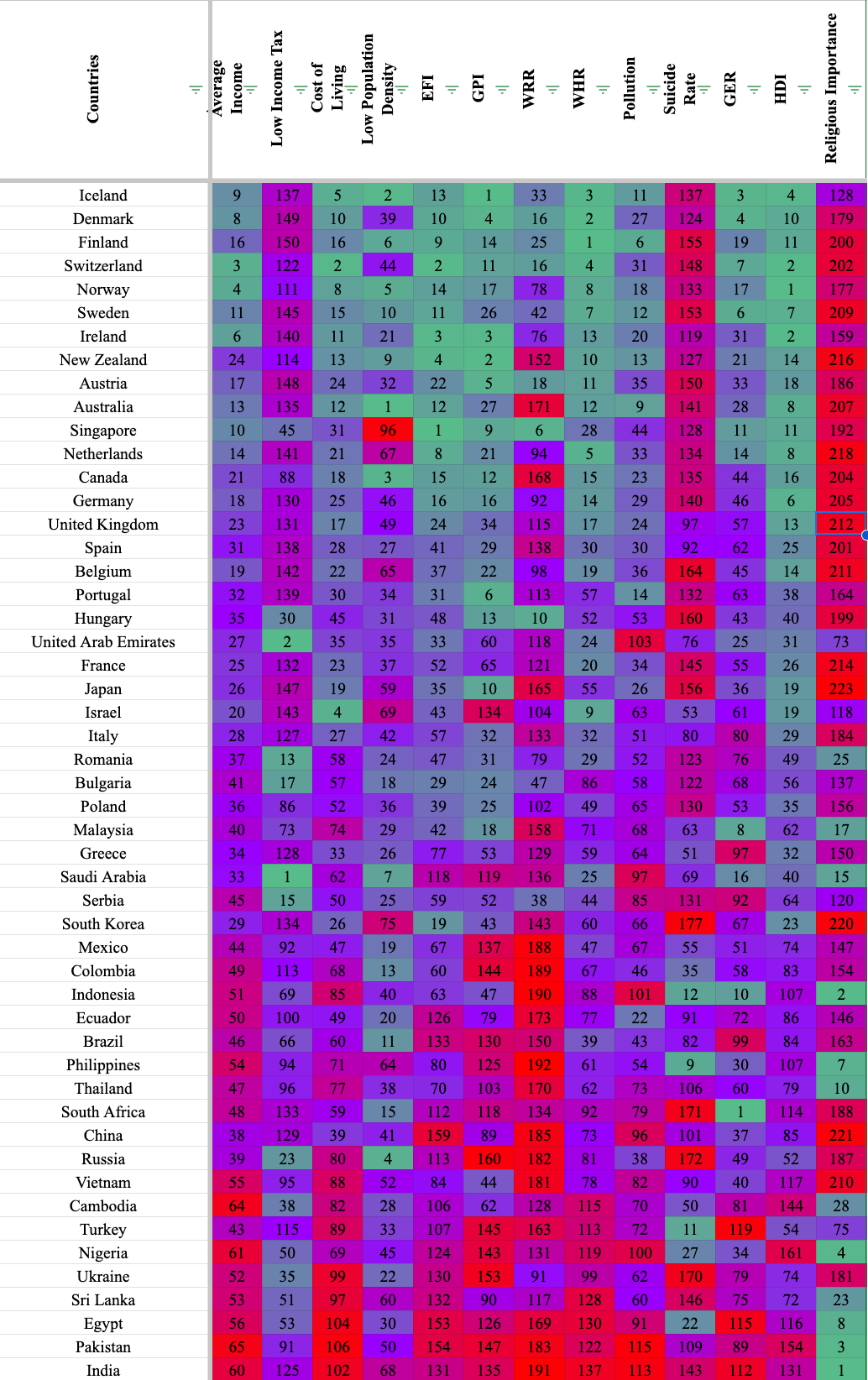
OC [OC] Overall ranking for 51+ Countries

Post image

My sheets document includes the sources, but the ranking uses 13 different sources. Sadly, not every country is included in every source so you will see blank spaces for countries that are left out in the data. I've also created a correlation index to see how different metrics matched up with each other and you can see the data I used for each ranking.

https://docs.google.com/spreadsheets/d/1YbfVevxEthNgDtK69P48Xm39bXLHi8eqfeFwxTTYEJE/edit?usp=sharing

Hope you like it, lemme know if you have any questions.

0 Upvotes

92 comments sorted by

View all comments

55

u/HCMXero OC: 1 2d ago

This is definitely not beautiful.

1

u/FluidModeNetwork 2d ago

I will agree that it is dense, the goal was to cater to both people who wanted to take a scan of the data or be more detailed and pick out a country and their specified metric

-2

u/FluidModeNetwork 2d ago

Any suggestions?

22

u/notionalsoldier OC: 1 2d ago

There’s nothing beautiful about a simple spreadsheet with conditional formatting. This isn’t even a visualization, nor does it convey any particular story. It’s just… data

2

u/tyen0 OC: 2 2d ago

conditional formatting

That also gives a false correlation between the different category rankings that does not exist.

-2

u/Luggruff 2d ago

That's your opinion. I think it is in fact beautiful. You're not the source of truth for what's beautiful and it is not objective. Sit down.

-1

u/o9p0 2d ago

the fact that color is used to represent degree or placement within a set of data, in fact, makes this a visualization.

-3

u/Luggruff 2d ago

That's your opinion. I think it is in fact beautiful. You're not the source of truth for what's beautiful and it is not objective. Sit down.

-8

u/FluidModeNetwork 2d ago

Well I mean yeah, you could interpret there being a story even if it was data. If you have certain markers for what kind of country you want to live in theres gonna be upsides and downsides. Iceland is economically great, but the suicide rates show living there is more tough than realized. This data shows that theres not a number one country that meets everyones expectations.

7

u/AlanKayII 2d ago

This is not what this sub is for though ?

-2

u/FluidModeNetwork 2d ago

Im not sure what you mean, is there another data driven community on reddit that this would fit better on?

3

u/notionalsoldier OC: 1 2d ago

Read the subreddit description and posting rules for this sub and let us know if you think this really belongs here

-2

u/FluidModeNetwork 2d ago

"DataIsBeautiful is for visualizations that effectively convey information. Aesthetics are an important part of information visualization, but pretty pictures are not the sole aim of this subreddit."

1

u/tyen0 OC: 2 2d ago

"and posting rules"

0

u/FluidModeNetwork 2d ago

You tell me what I'm violating here

Rule 11: Comments need to be constructive

3

u/c126 2d ago

You’re in the wrong sub. Try r/data

2

u/Ewan_Derstand 2d ago

Beauty is in the eye of the beholder. If the purpose of the visualization is to illustrate potential correlation between the national happiness index and other variables, I would personally use a lattice chart with scatterplots where each data point is a country.

So something like this. Lots of room for further refinement here, just highlighting an option for OP to consider.

0

u/FluidModeNetwork 2d ago

Oh I love this, is this what you did based on my data? I'd love a higher res image.

That said, instead of that, what I did what make an interactive correlation chart thingy because there are so many combinations you can make from 13 sources. Did you take a look at that? Or were you looking to create a single image of all of them? I also made a table showing each combo of two metrics coefficients to make it easier to determine which correlate or not and what was worth looking at.

The main goal of this image was to make a countries ranking, not a correlations table. But I would be happy in making a visualization for that.

1

u/Ewan_Derstand 2d ago

Yes, this was generated using your data

1

u/Ewan_Derstand 2d ago

A matrix ("lattice") of scatter plots can be an effective technique to illustrate differences in the correlation between variables in a set of data. It is typically not useful as replacement to a reference table, such as the ranking of each country in this case.

0

u/Ewan_Derstand 2d ago

Beauty is in the eye of the beholder. If the purpose of the visualization is to illustrate potential correlation between the national happiness index and other variables, I would personally use a lattice chart with scatterplots where each data point is a country.

So something like this. Lots of room for further refinement here, just highlighting an option for OP to consider.

1

u/Ewan_Derstand 2d ago

Replying to my own post to add a slightly refined version with population size and region added for additional depth.

Sorry about the low resolution, this is the best I can do from my phone.

1

u/ICrushTacos 2d ago

Include weather.

1

u/FluidModeNetwork 2d ago

WRR stands for world risk report.

1

u/Synaptic_raspberry 2d ago

Maybe plot a 2 dimensional UMAP or PCA projection of data to show how countries cluster?

Edit: UMAP is probably more appropriate, since these are rankings and not parametric data

1

u/o9p0 2d ago

you’re being downvoted on your own diagram for requesting feedback? Reddit needs an enema. Let’s see if we can turn this around. I upvoted.

2

u/FluidModeNetwork 2d ago

Thanks man, appreciate it. Didn't think something like this project would get this much controversy.

1

u/o9p0 2d ago edited 2d ago

You might get more mileage out of this by simply horizontally sorting the metrics (e.g. by correlation factor) or manually grouping them by perceived relatedness, and then sorting the countries vertically by some dimension (e.g. GDP). The idea of a visual heatmap is to help you visually discover correlations and outliers. And you won’t really see any meaningful clustering without adding meaning to the horizontal and vertical axes. A correlation index alone may not reveal the story.

1

u/FluidModeNetwork 2d ago

Could you give an example of what that would look like?

1

u/o9p0 2d ago

i’ll try, but in some senses, it’s for you to define according to the story you want to tell, or to define in service of finding insights (only to inspire deeper digging) that ultimately strengthens your story.

For example, you could group the horizontal axis by financial factors (e.g. avg. income, tax rates, etc), sociogeographic factors (e.g. population density, pollution, etc.), and personal health factors (e.g. happiness, suicide, emotions).

Disclaimer: this is just my own mental model for how to group. You know these better than I do, so provoke the groupings on your own terms. Then, look at each of your groupings and determine if sorting within them left-to-right in some fashion is useful, and establish the rubrics for your choices there).

Vertically, you could sort by any number of things: The longitude or latitude of the country’s capital, geographic proximity to one another (e.g. clustering by continent), total population, GDP, economic ideology, governmental system, etc.

Or you could group them by a simple binary like whether they have at least one McDonalds or KFC.

Again, this is really up to you. In the development of these visualizations. we are usually on a path, and depending on whether we’re in the analysis phase or reporting phase, we may do things differently. You could look at these groupings and decide their useless. But you still has to try them to look for correlations. And you might eliminate or try an alternate grouping / sorting of the exploration didn’t demonstrate any utility.

Hope that helps.

-2

u/gturk1 OC: 1 2d ago

This is beautiful to me. The data itself is fascinating, which is a form of beauty. If people want to argue that the visualization isn't pretty, I would first point out that it is non-trivial to convey 13-dimensional data in a form that is both informative and aesthetically pleasing. One other commenter suggested multiple scatter plots, which might convey data nuance better, but is not nearly as visually pleasing as this colorful visualization.

This sub is full of sankey diagrams and bar charts. People often let these go by without comment, but THIS is the data visualization people here are criticizing?

1

u/FluidModeNetwork 2d ago

Wow, thank you so much. I made this a couple of years ago so I thought it would be interesting to share. If you have any thoughts either about improvements or what you'd like to know about the data, I'd be happy to hear them.

1

u/gturk1 OC: 1 2d ago

You could make a 2D diagram of the correlation indices and color code them. That way, you could look at the 2D grid and see patterns in the correlations.

I couldn't easily pick out where you found the numbers for religious importance. Is it one of the links on the first tab of your sheets? Thanks!

1

u/FluidModeNetwork 2d ago

Yes sorry, Its this one

https://worldpopulationreview.com/country-rankings/least-religious-countries

Though this was made a couple years ago, so I dont know where on the site lmao. I think it might be in the ranking lists.

1

u/gturk1 OC: 1 2d ago

Thank you!

1

u/o9p0 2d ago

to be clear there are only two dimensions in this visualization: country, and metric.

1

u/gturk1 OC: 1 2d ago

If you mean that the visualization is a 2D image, then I completely agree with you. If you mean that this visualization only shows 2D data, I disagree.

This data is 13 dimensional, and this visualization shows all 13 dimensions. One data points is a country. Each country has 13 dimensions, with each dimension being some kind of measure. To see this, pretend that there were only two measures, religious importance and suicide rate. I picked these two because the OP was interested in seeing whether these correlate. Now, we can graph each point (each country) in a 2D plot, with one axis as religion and the other being suicide. If we add a third measure, we could plot those points in 3D.

Alas, there is no really good way of showing 13 dimensions at one time in an image. I think the OP made a good choice in how this 13 dimensional data is shown, but it is far from ideal.

1

u/o9p0 1d ago

No, the visualization. It only shows data in two dimensions.

While each column represents a different data set (potentially correlated), those data sets are presented on one axis as a single dimension: metric.

By your logic, each country could be a dimension. But they are singular entities with a singular value, just as each entry on the horizontal axis is.

1

u/o9p0 1d ago

I’ll correct myself. I’d say there are three dimensions. The heatmap color coding of the ranking is indicating the third: a judgement of goodness or intensity