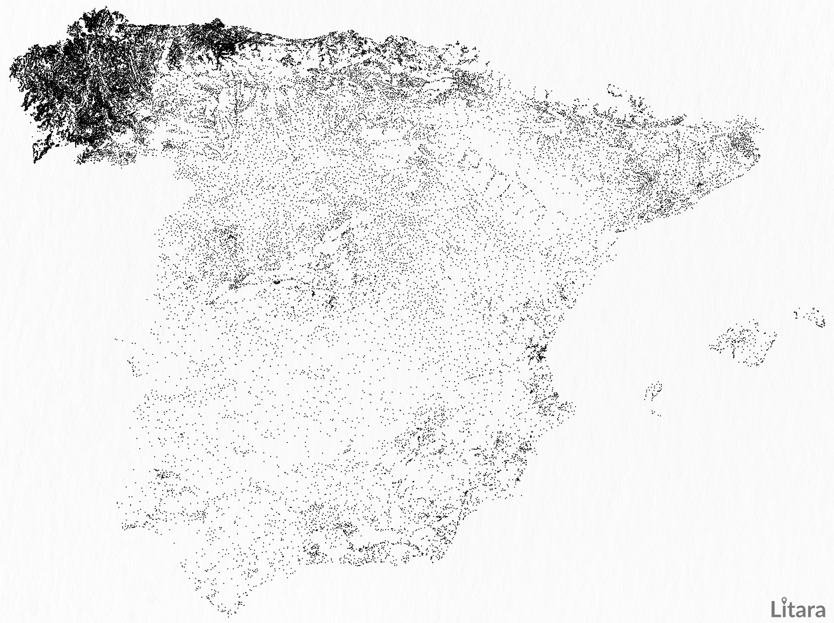
r/dataisbeautiful • u/paveloush • 13h ago
OC [OC] I visualized 52,323 populated places in European part of Spain and accidentally uncovered a stunning demographic phenomenon.
4.4k
Upvotes
r/dataisbeautiful • u/paveloush • 13h ago
r/dataisbeautiful • u/oscarleo0 • 1d ago
r/dataisbeautiful • u/Luton_Enjoyer • 20h ago
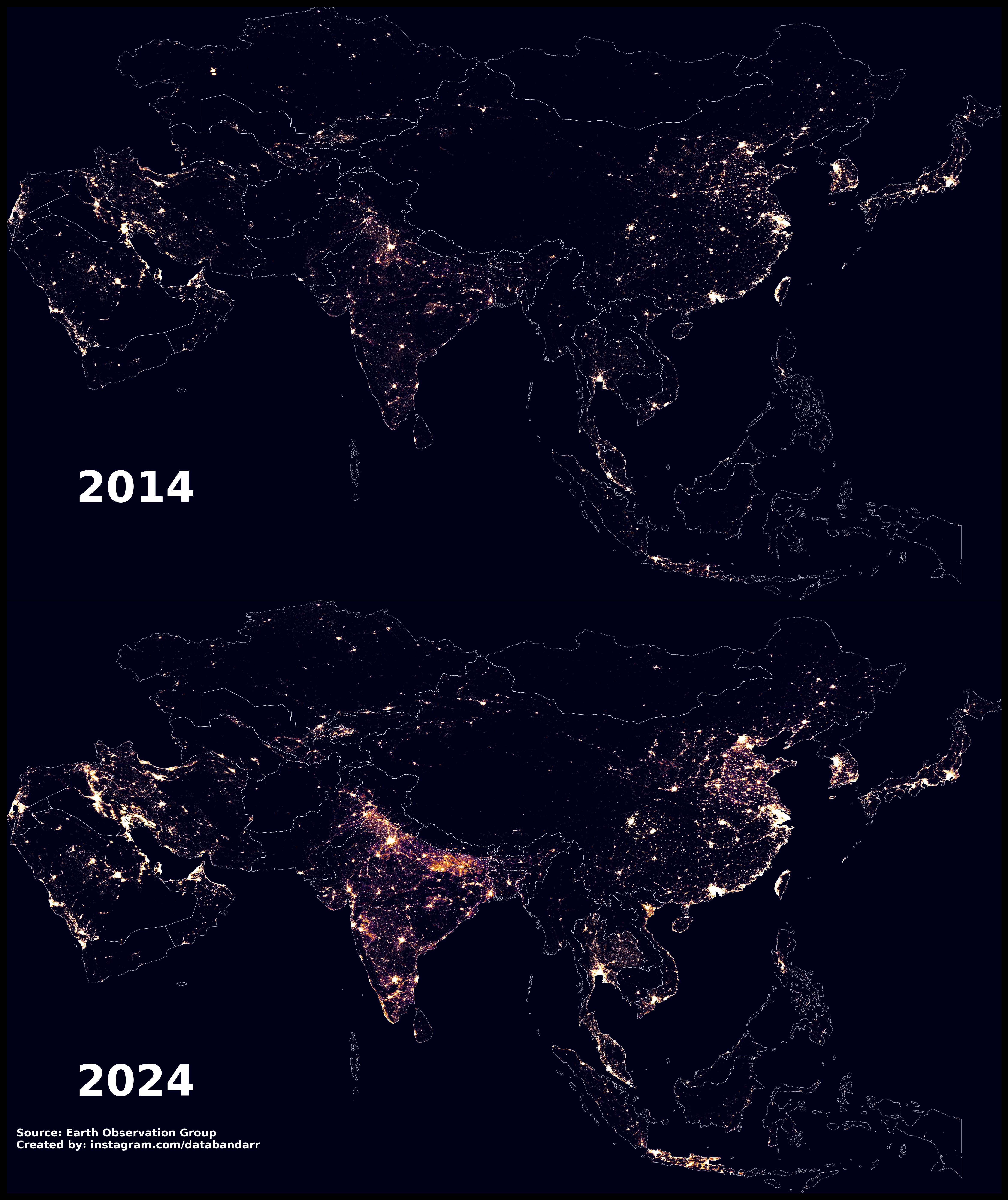
r/dataisbeautiful • u/ramnamsatyahai • 2d ago
Reposting with updated data , the 2012 composite used a different method and partial coverage, which made some regions (like Thailand) appear darker. This version uses average annual masked VIIRS data for a fairer 2014–2024 comparison.
r/dataisbeautiful • u/Proud-Discipline9902 • 2h ago
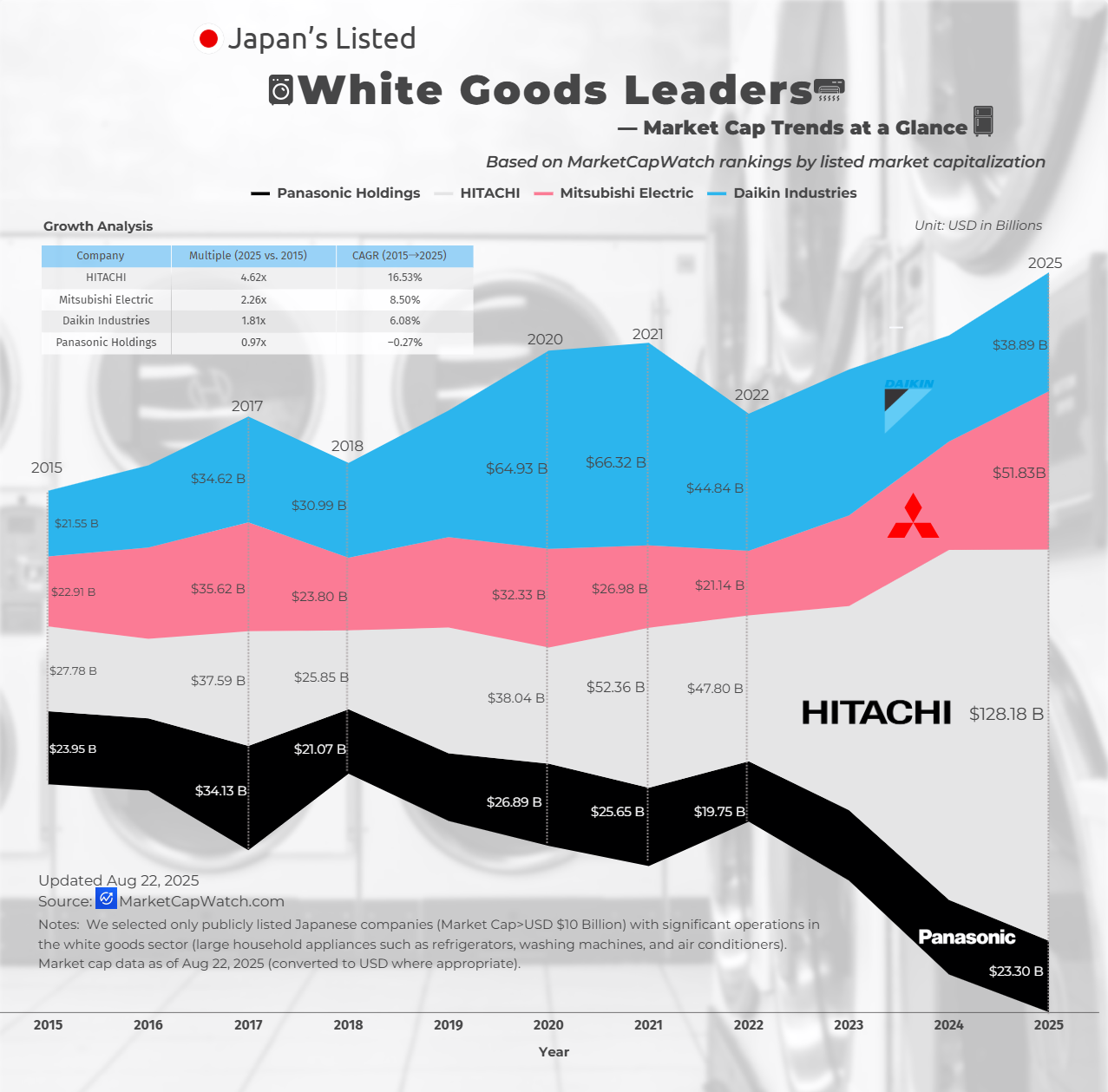
Data Sources: Market Capitalization: Sourced from MarketCapWatch.
We selected only publicly listed Japanese companies (Market Cap>USD $10 Billion) with significant operations in the white goods sector (large household appliances such as refrigerators, washing machines, and air conditioners). Market cap data as of Aug 22, 2025 (converted to USD where appropriate).
FAQ — Understanding This Chart
Q1: Why isn’t Sony included? Sony’s core business is in consumer electronics, gaming, entertainment, and financial services. It does not operate at scale in the white goods category (large household appliances like fridges, washing machines, ovens, and air conditioners), so it falls outside the scope of this chart.
Q2: Why isn’t Toshiba included? Toshiba was delisted from the Tokyo Stock Exchange in December 2023 after a buyout and is now privately held. Because our dataset only covers publicly listed companies, Toshiba is excluded.
Q3: What exactly counts as “white goods” in this analysis? We define white goods as large household appliances for cooling, cleaning, and cooking — e.g., refrigerators, washing machines, ovens, dishwashers, and air conditioners. Companies must have significant sales in these product categories to qualify.
Q4: Why are companies mainly HVAC specialists (e.g., Daikin) included? HVAC products — particularly large air conditioning systems — fall under the “white goods” umbrella in many industry classifications. Companies with significant domestic appliance presence in HVAC are included if they are publicly listed in Japan.
Q5: Why does the market cap vary so much between companies? Some giants (like Hitachi or Mitsubishi Electric) are diversified conglomerates with revenue streams far beyond appliances.
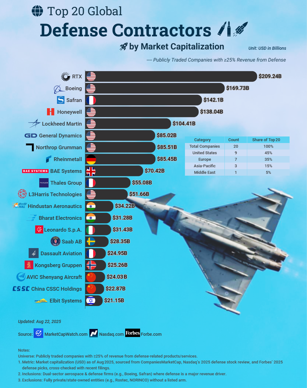
r/dataisbeautiful • u/Proud-Discipline9902 • 2d ago
Methodology & scope:
r/dataisbeautiful • u/willkoeppen • 2d ago
This animation shows water levels on the upper Guadalupe River from midnight July 4, 2025, to 6 p.m. July 5 (local time). The flood killed 119 people in Kerr County, including 25 girls and two teenage counselors at Camp Mystic.
Data sources
Tools:
Interactive version with contextual information: https://www.willkoeppen.com/datavis/guadalupe-floods/
r/dataisbeautiful • u/TheHonestRedditer • 1d ago
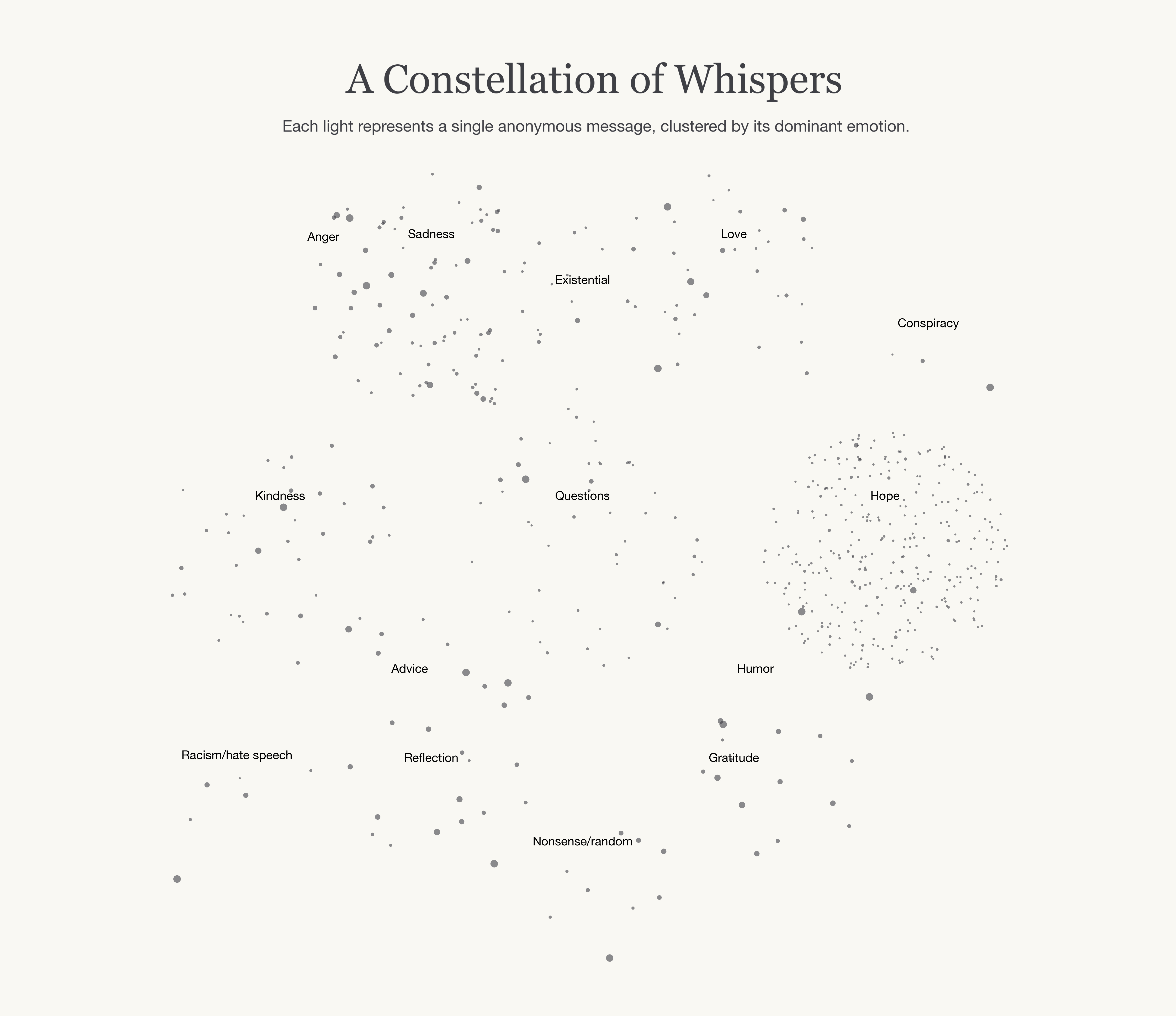
Data source: Collected from my web app Daylettr, where users anonymously write one daily note for the next user and receive a random one from the previous one. This captures raw human thoughts under guaranteed anonymity (no logins, no tracking). Full dataset: 1548 messages
Tools: Python (pandas for processing, seaborn/matplotlib for visualization). Emotions classified via keyword matching (e.g., 'hope' for words like 'hope', 'better'; expandable for nuance).
Insights: Anonymity seems to encourage positivity (even if it seems that it might do the opposite), over 60% of messages fall into uplifting categories like kindness, gratitude, and hope. But there's depth: reflection dominates when people ponder life, with rare but raw sadness or humor peeking through. It shows humanity's spectrum: supportive yet vulnerable.
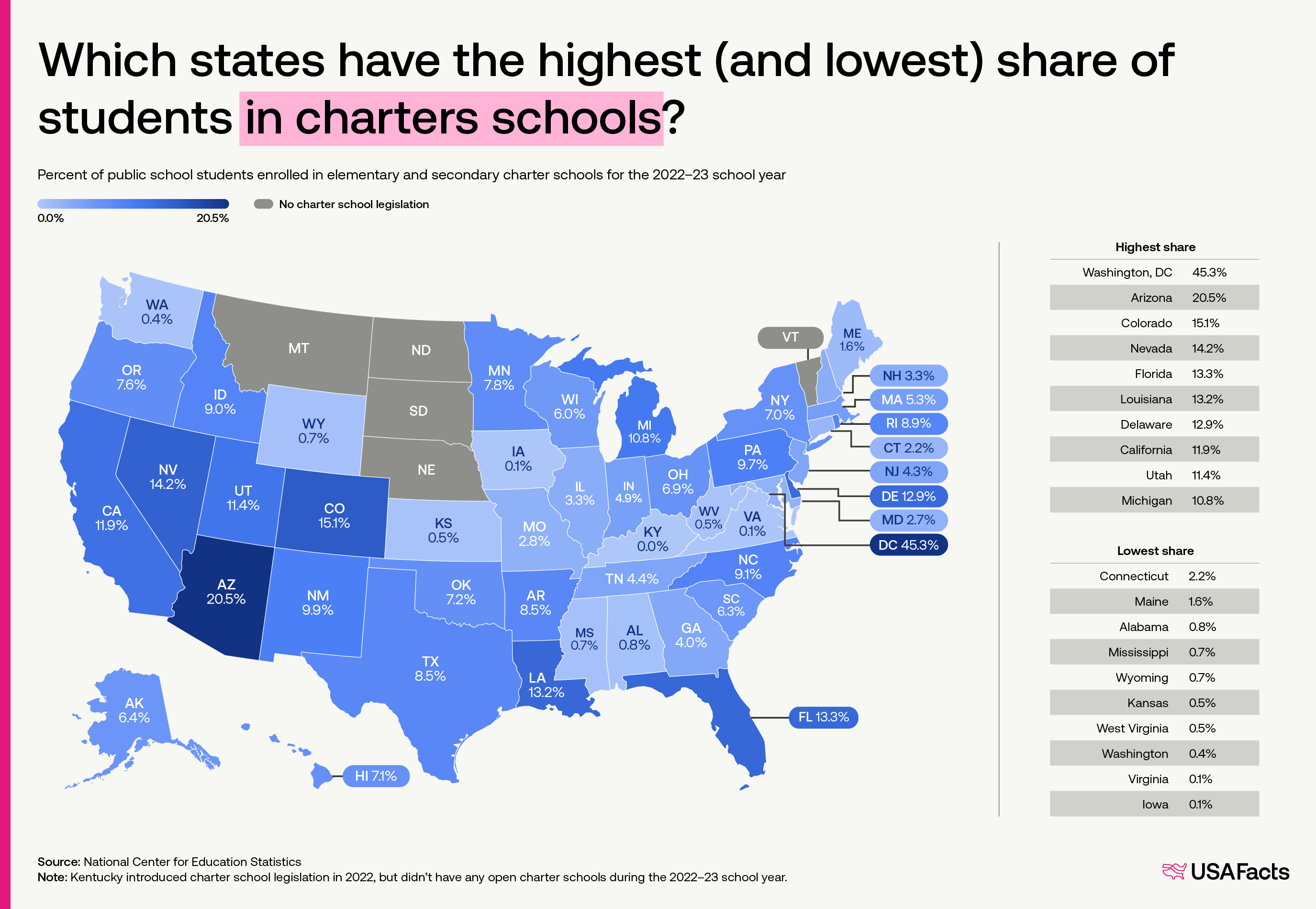
r/dataisbeautiful • u/USAFacts • 2d ago
r/dataisbeautiful • u/haydendking • 2d ago
r/dataisbeautiful • u/FluidModeNetwork • 19h ago
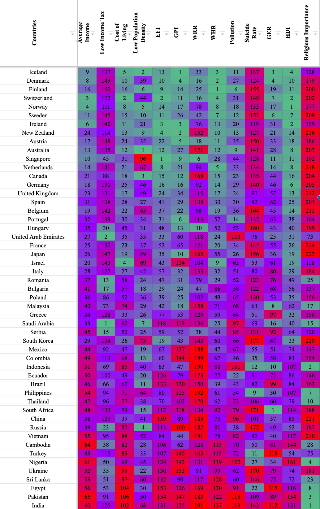
My sheets document includes the sources, but the ranking uses 13 different sources. Sadly, not every country is included in every source so you will see blank spaces for countries that are left out in the data. I've also created a correlation index to see how different metrics matched up with each other and you can see the data I used for each ranking.
https://docs.google.com/spreadsheets/d/1YbfVevxEthNgDtK69P48Xm39bXLHi8eqfeFwxTTYEJE/edit?usp=sharing
Hope you like it, lemme know if you have any questions.
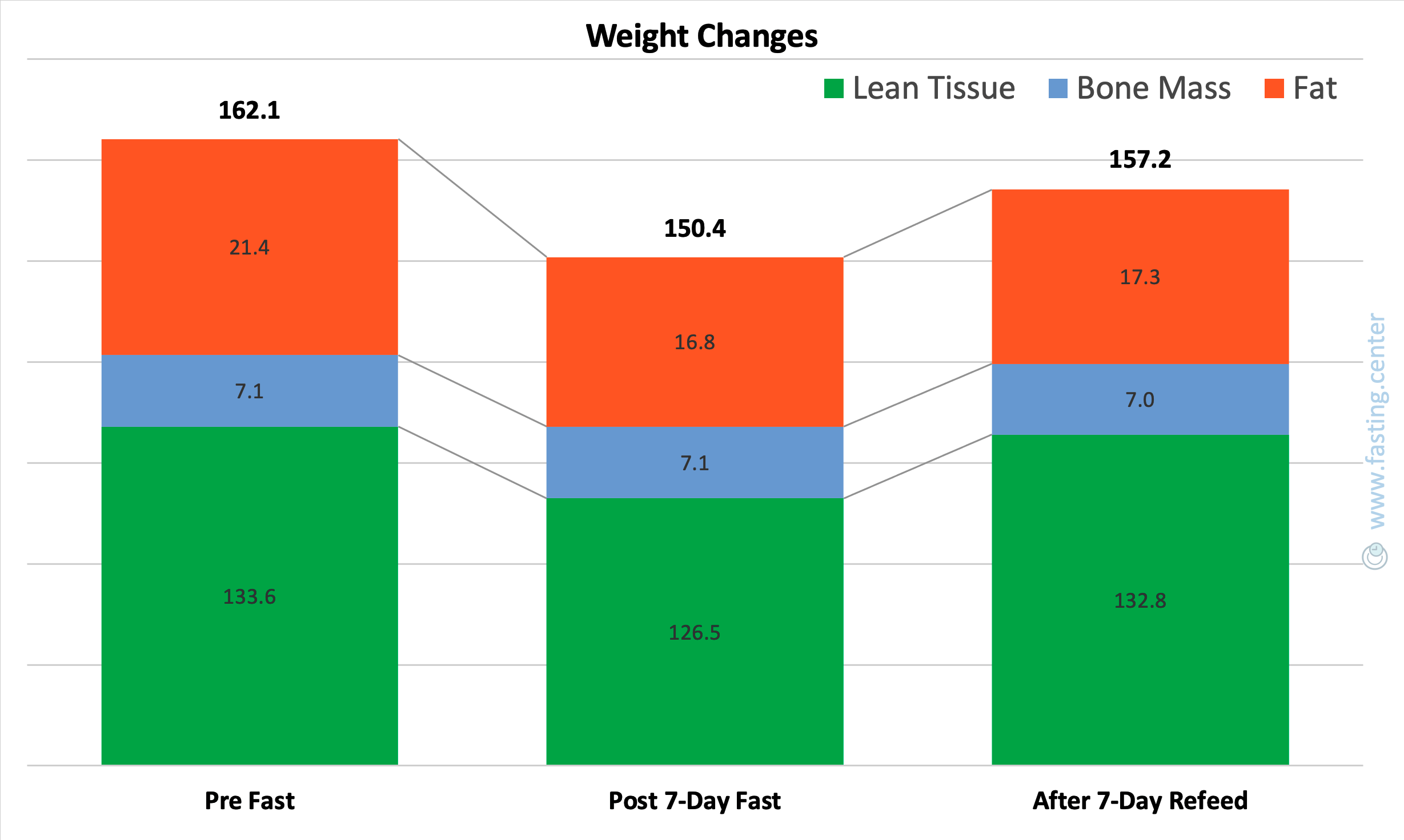
r/dataisbeautiful • u/andtitov • 19h ago
I tracked my body composition before a 7-day water fast, right after, and then after 7 days of refeeding.
One picture shows just how extreme - and fascinating - the changes were 😊
r/dataisbeautiful • u/Inboxmeyourcomics • 1d ago
When using the file visualization graph view, the files from this subset naturally form a two-arm galaxy. Data source shown in following images. Tools used: obsidian MD
r/dataisbeautiful • u/ppsreejith • 1d ago
A dataset of PERM applications from the US Dept of Labor & AI chat to allow you to explore the data
r/dataisbeautiful • u/Rauram99 • 2d ago
Notes:
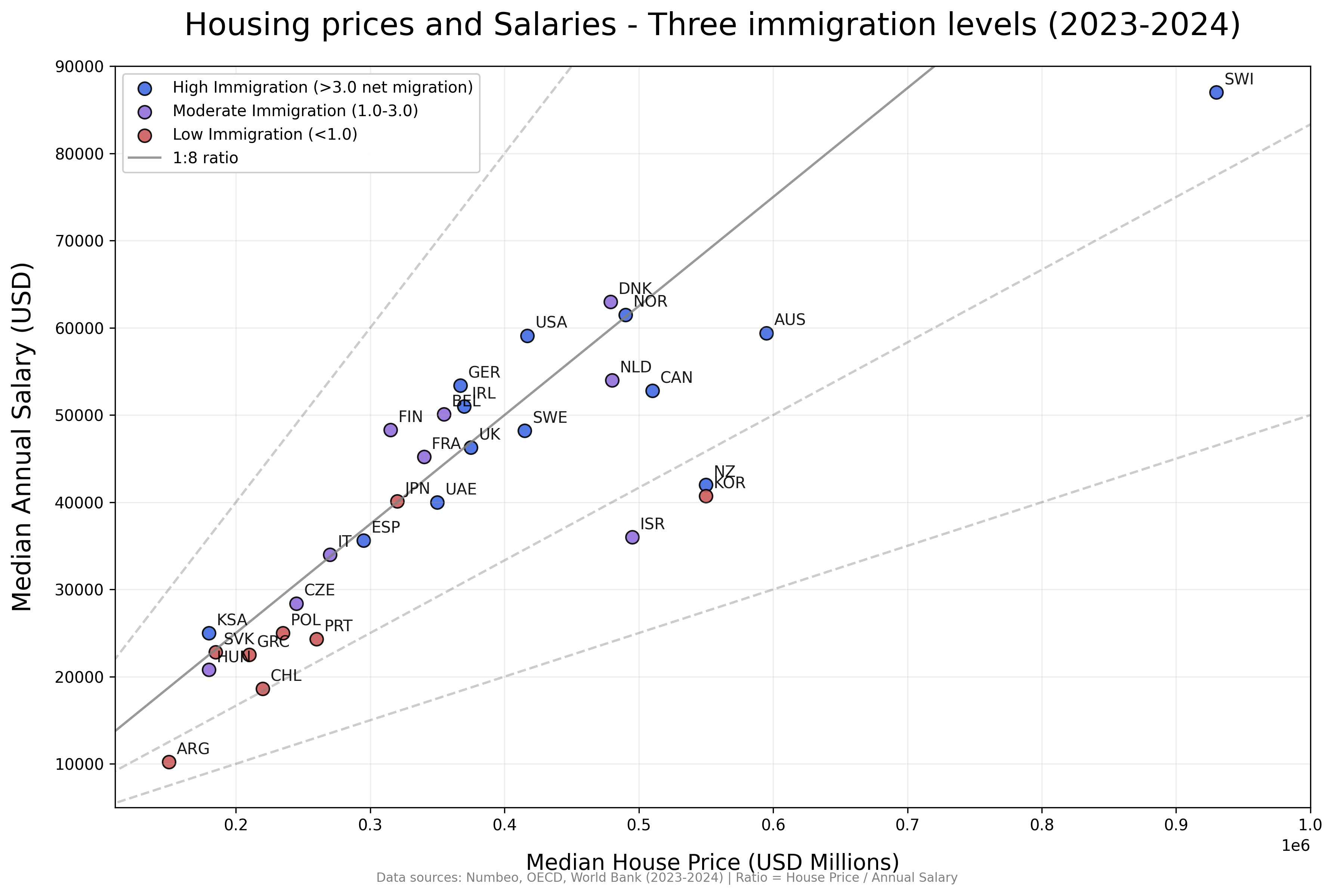
I only included countries with >0.830 HDI >5 Millions population.
Net migration rates are a cumulative average for the last 5-10 years.
r/dataisbeautiful • u/rsrgrimm • 2d ago
To assess how draft position affected league performance, I looked into over 400 12-man leagues (all snake drafts) and plotted win ratio, normalized points earned (normalized within a given league to account for various scoring and roster settings), and final league ranking for each draft position.
Surprisingly, 1st pick performed worst on average across all metrics.
League data collected from Sleeper API.
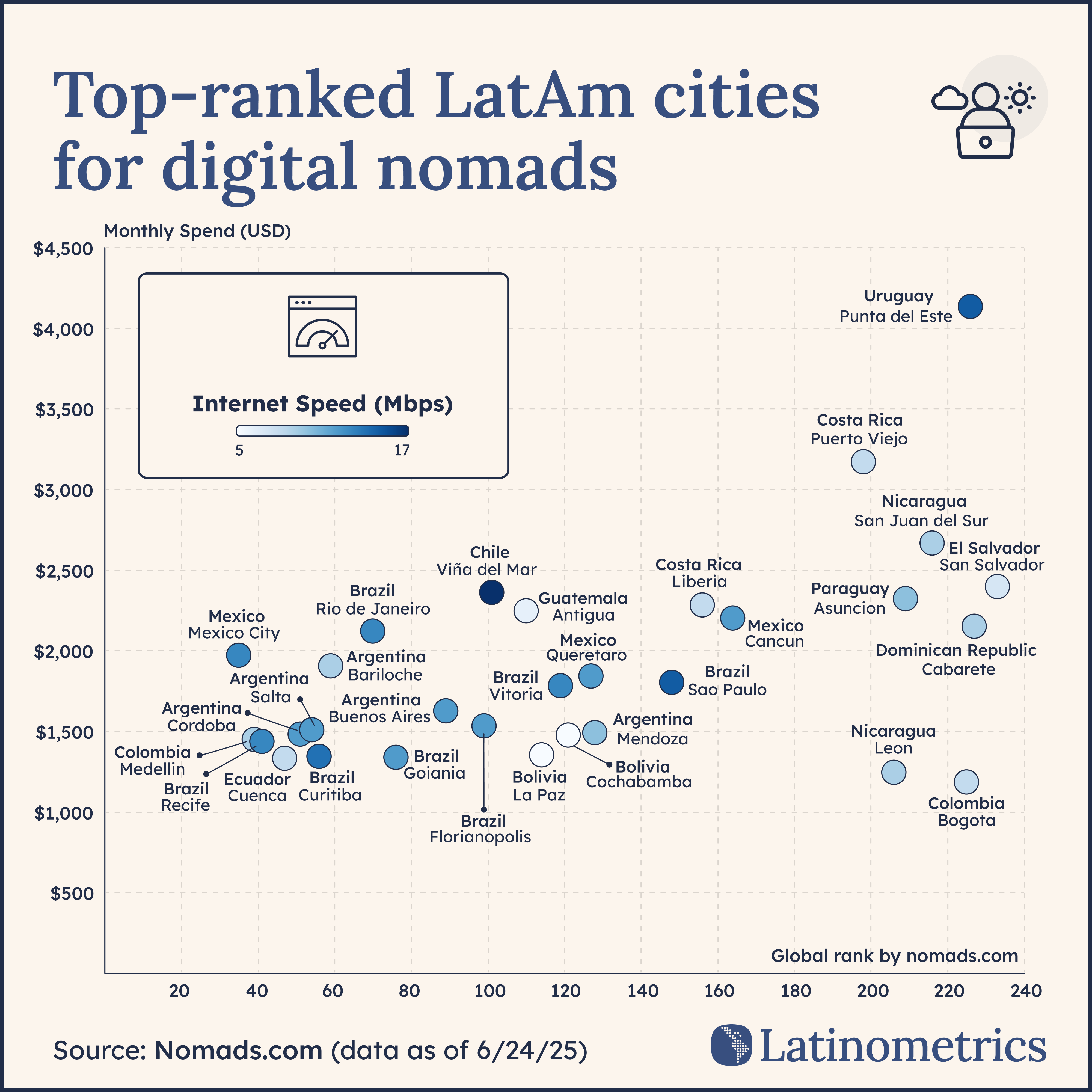
r/dataisbeautiful • u/latinometrics • 2d ago
🌎 💻 Mexico City locals are marching in the streets against digital nomads driving up their rent - but it's not the only LatAm hotspot facing this dilemma ↓
In case you missed it, hundreds of locals marched across Mexico’s capital and largest city in protest of a spike in mass tourism and digital nomads which began a few years back with the start of the COVID-19 pandemic.
The chilangos carried signs raging against the rising cost of living and gentrification across their city, in particular in sought-after neighborhoods like Condesa, Polanco, and Roma. They demanded stricter housing laws and regulation.
While Mexico City may be seeing the most virulent response to the influx of digital nomads since 2020, it’s far from the only metropolis attracting these remote workers. Across Latin America, teleworkers have traded in high US or European prices for sun, good food, and cheaper rents.
Let’s take a look at which places in our region they like the most, according to nomads.com, a site that helps them connect.
In fact, the world-famous carioca beaches of Leblon and Ipanema, classical architecture of Buenos Aires, and sensational food scene of São Paulo have all attracted international workers to come and establish their residency.
Governments across the region – including Mexico – have rolled out the red carpet for these foreigners (with their dollar- and euro-denominated salaries), with Brazil, Costa Rica, Ecuador, and Panama among the countries which have established a digital nomad visa in recent years. Colombia has one in the pipeline.
story continues... 💌
Source: Nomads.com
Tools: Figma, Rawgraphs
r/dataisbeautiful • u/Description_Capable • 2d ago
TL;DR: Comprehensive statistical analysis of Samsung 980 Pro thermal performance with/without passive cooling. Includes confidence intervals, effect size analysis, and thermal zone distribution visualization.
Data Source: AIDA64 CSV thermal logging during controlled CrystalDiskMark benchmarking Tools: Python (pandas, matplotlib, scipy.stats, seaborn) Sample Size: 2,266 pre-installation measurements, 3,089 post-installation measurements
Methodology:
Key Visualizations:
Notable Technical Details:
Data Quality: All measurements taken under identical conditions with 1-second resolution. Raw CSV data and analysis scripts available on GitHub.
The visualization demonstrates how a $15 hardware modification can produce measurable, statistically significant performance improvements with proper data collection and analysis methodology.
r/dataisbeautiful • u/jlawrence10 • 1d ago
I don’t know if this is appropriate for this community (but I assume a bot will inform me if not).
These are simply screen shots, laid against as blank a background as I can find on the Gaia GPS app, that show all of my human powered travel around Mt. Hood, Oregon in the last maybe 10-12 years. Ok, also a couple ski lifts (straight lines). I am lightly, but only lightly, considering turning this into a tattoo. (A potentially living document, as I add lines through more outdoor activity.)
I wonder if anyone is able to make this sort of data a bit more beautiful. The first shot is all of the routes, and this would comprise the main image. The second shot is zoomed in a little closer, just to give an idea how many lines there are. The last two shots are zoomed in even more on two of my heavily traveled areas, to show all the overlapping lines. I love the specificity, and some of these lines are even specifically evocative for me, but I don’t know if this would be tattooable, or look good if it is. But maybe there’s a way to do a sort of “heat map” - I dunno, maybe not, that’s why I’m throwing this out there!
I guess if someone wanted to go crazy I could figure out a way to send ACTUAL data, but that would be asking a lot…
Anyway, thanks, maybe!
r/dataisbeautiful • u/Data_digger1 • 3d ago
r/dataisbeautiful • u/Competitive-Path-798 • 2d ago
r/dataisbeautiful • u/danielgolliher • 3d ago
r/dataisbeautiful • u/sillychillly • 3d ago
Looking at 3 swing states (FL, NV, NC), we can see that Americans are registering more as Unaffiliated than either major party. This is especially true for young americans who overwhelmingly register as Unaffiliated.
This shows what most of us know, there is a growing disillusionment with both major parties. It's not that people are moving from the Democrats to the Republicans, it's that people are disavowing both parties and registering as Unaffiliated.
I hope you all can see, like myself, that the most recent NYT voter registration article missed a major portion of the voter registration analysis and is about as close to journalistic or data analytic malpractice as one could get. It almost seems intentional.
______________
Big thanks to the team for pumping and organizing the data!
tool used: Tableau
data source: Florida voter list from Florida Secretary of State: https://dos.fl.gov/
Register to vote: https://vote.gov
——————
Contact your reps:
Senate: https://www.senate.gov/senators/senators-contact.htm?Class=1
House of Representatives: https://contactrepresentatives.org/
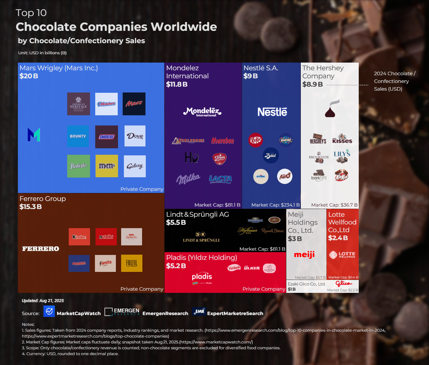
r/dataisbeautiful • u/Proud-Discipline9902 • 3d ago
This visualization is part of a broader analysis I conducted to map the global chocolate industry’s largest players by both market capitalization and annual chocolate/confectionery sales.
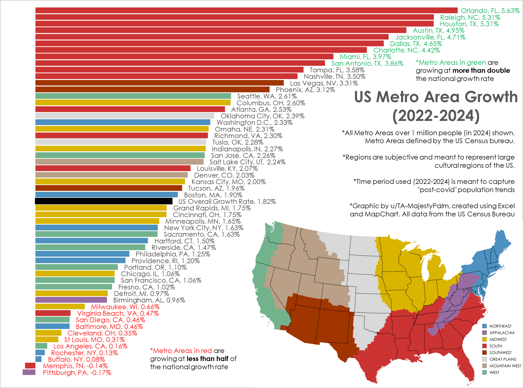
r/dataisbeautiful • u/TA-MajestyPalm • 3d ago
Graphic by me, created in Excel. All data from US Census here: https://www.census.gov/data/tables/time-series/demo/popest/2020s-total-metro-and-micro-statistical-areas.html
I've created similar graphics in the past, but usually from 2020-2024. This is not the best time frame as it combines the abnormal covid years with post pandemic movement.
This time frame (2022-2024) shows the most current and ongoing population trends of the last 2 years.
I also wanted to better categorize the cities into broad cultural regions vs the arbitrary geographic census regions.