129
22
12
u/HootleMart84 12d ago
Well there goes my process of getting reamed by my bf every morning to build up the creativity to do graphic design
15
3
u/GlobalIncident 12d ago
Maybe if there was a margin for negotiation this would be a little more readable
11
u/veryconfusedspartan 12d ago
That's just you dude, or maybe my eyesight isn't so bad to blend those two together
7
13d ago edited 9d ago
[deleted]
8
u/TheCosmicJester 12d ago
And it’s everywhere. When Helvetica is well deployed, it’s iconic. Target, JCPenney, Crate & Barrel, Toyota, Jeep, Harley-Davidson, 3M (and the Scotch tape and Post-It notes they make), MLB American League and the NBA, Verizon’s old logo, even McDonald’s are all brilliant uses of Helvetica. On the other hand, if you get lazy, you get The Gap’s disastrous rollout or Verizon’s new wordmark. And if that’s all enough to give you a headache, CVS also uses it.
6
u/Celestial__Bear 12d ago
Better than Arial!
2
u/SuperPowerDrill 11d ago
I despise Arial. I've always thought it looked ugly and annoying bc it's been so overused. But then I had a teacher who made us do weekly essays related to whatever we were studying. And it couldn't just be a summary, we had to bring "something new" to it, she used to say we were "practicing for a thesis". I hated it. I wasn't that into most themes despite it being my favourite subject. I hated the teachers presumptuous, arrogant ass. And I hated that she'd only accept essays written in Arial. Not even TNR, only Arial. It was the perfect shit storm to solidify my hatred by this soulless, bland font
3
u/Celestial__Bear 11d ago
I can feel the steam gushing out of your ears from this! That teacher sounds like an ass. You’re right about it being so sterile and soulless. I work in video games, and arial is the default font on the software we use. Everything looks so amateur and incomplete until we change it.
2
3
u/dr_Fart_Sharting 12d ago
Agreed. Times New Roman is just so much better for everything.
2
u/073068075 12d ago
Bookman old style is also nice if you want the tnr-like look but in a slightly different flavour.
2
9
u/BenThereOrBenSquare 13d ago
I'm not seeing it. Looks fine to me.
10
u/BetterKev 12d ago
Despite how blatant it is, I couldn't see it on my own, and I still don't see it without looking closely.
But the pieces are so obvious. I think my brain is doing that brain thing where it fills in what makes sense over what it actually sees. Lk rdng sntncs tht don't hv vwls.
2
u/TimeBoysenberry8587 12d ago
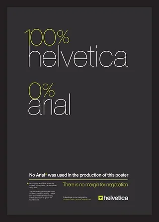
"0% arial" --> "0% anal"
9
u/BenThereOrBenSquare 12d ago
Oh, I know what OP meant. I just don't think this font is kerned poorly. Like are we really going to be posting Helvetica here?
2
u/desrevermi 12d ago
Gotta have standards.
Anyways, who does the opposite?
8
u/axon-axoff 12d ago
Use Arial? I do. Fuck that prissy uppercase R in Helvetica.
1
u/desrevermi 11d ago
Screw it. Just type in Wingdings.
No way to decipher that. Worse than trying to type in emojis by factorials. !
:D
1
96
u/Safloophie 12d ago
I’m more confused about what this poster is for