3
4
u/TheMoro2869 Jul 15 '25
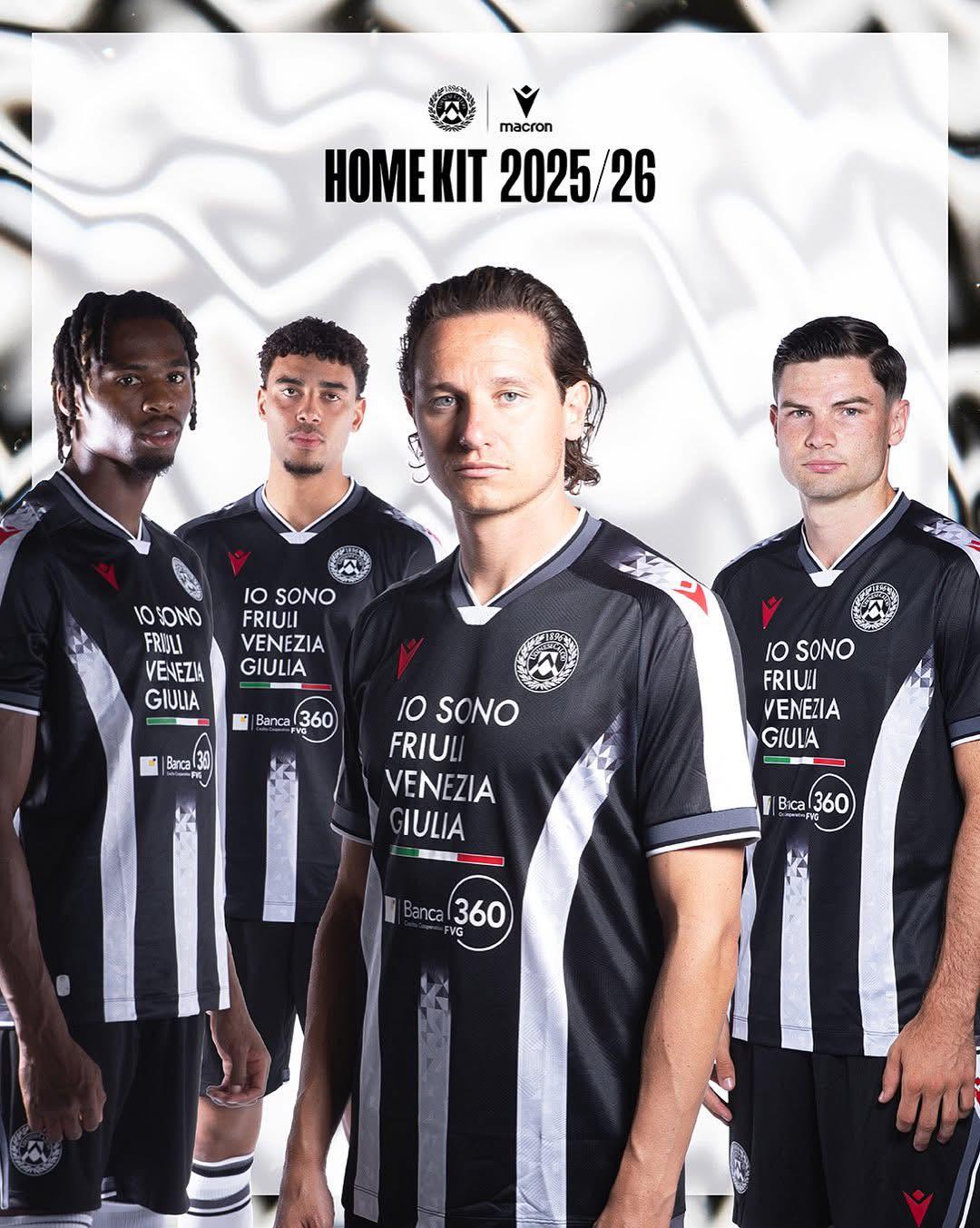
That sponsor...
1
u/whodat514 🇨🇦 Jul 15 '25
I know, the only issue, or else this is a top notch jersey
3
u/TheMoro2869 Jul 15 '25
Sure, the black base is classy, also i would have liked more Red details
1
u/FPavan96 Jul 15 '25
I'm warming up to it the more I see it. The red macron badge looks sharp. It's definitely a modern/fusion-style twist. I actually found last season's home kit to be the best I've seen in many years. It was all class, even despite the awkward sponsor logo. I want to see this one in action to have a full opinion but it's not bad.
2
u/unclefeed Udinese Club España Jul 16 '25 edited Jul 16 '25
Am I the only one that hates it?
- space blatantly made for that ugly sponsor
- badge in black/ grey and white, and not in its original colours
- red details, when red is the colour of Triestina and red is not a historical colour like blue and yellow, or even orange.
I’m personally quite disappointed. Overall it’s not too bad but it’s not Udinese for me. Would have been a better shirt for Cartagena CF instead IMO.
Edit: just remembered that our kit 2005-06 kit did have some red, although due to the sponsor Lotto. Either way, still not a big fan of it.
1
u/MeanCharity1978 Jul 16 '25
I kinda dig it, different and the black and red go's hard. I'm more of a classic guy nothing will ever compete with the 08-09 season kits by Lotto. I really expect nothing with Macron.
1
u/scraphound Jul 17 '25
I also don’t love these but I just hope we don’t have that stupid frog again. These feel like they were generated on a computer (I know they all are) and that a team going down would wear. Curious about the away kits…
7
u/PerksOfBeingABarFly Cjargne Jul 15 '25
I wonder if they designed the kit around the sponsorship to make it look less awkward.
Overall, not bad, but certainly have had better