r/vexillology 10h ago

OC Flag for the island of Britain

Post image
4 Upvotes

13 comments sorted by

12

u/Imaginary_Barber1673 8h ago

No offense but please make it stop

1

u/musubana 7h ago

I get you’re tired of UK redesigns (with Welsh inclusion)…👍 But did you ever see a flag ”for the island of Britain” on here before? (I sure didn’t!🙂)

3

u/Imaginary_Barber1673 7h ago

I just think it’s not pretty tbh. I imagine it flying on a ship and it seems unbalanced. I liked one of the yellow line versions better though.

Don’t mean to be mean : (

2

u/musubana 6h ago

ok, fair enough :)

4

u/chris--p 5h ago

It's still repetitive nonsense. It's basically just the original flag of the Kingdom of Great Britain but with green at the bottom.

1

u/musubana 4h ago

Yea, I agree the design has been … overdone. Just the concept is new here – a flag for the British island.

2

u/xander012 Middlesex 6h ago

Using the tudor bicolour just isn't the way to add wales in though, it'd really go as St David's cross fitting in somehow but everyone insists on the dragon & tudor bicolour as the only option. If we're doing that I think there's way cooler ways to do it like using the Scottish unicorn, English lion/white dragon and the Welsh dragon and making something reminiscent of the royal banner but more visually interesting. We could also incorporate Cornish representation into such a flag

4

u/AwayCable7769 7h ago

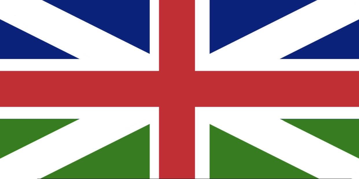
Green is odd. Reminds me of all the people attempting to put Wales into the flag. But still, the best way to include Wales in the union jack is to include the flag of saint David.

(Design not by me but I cannot remember who it was who posted it! I just preach the idea because I agree with it so much!)

2

u/Immediate_Guest_2790 8h ago

Isn't St Alban the patron of GB (more or less)?

2

u/krist-44 8h ago

Green is pretty off putting tbh

1

u/TheNaidenchop 6h ago

OP: make Britain (flag) symmetrical again

1

u/reddietea 1h ago

She's beautiful as she is

1

u/BitEuphoric7134 4h ago

Needs more dragons 🐉